The method that you will use to display the chart will be different depending on the development environment: a Java Development Environment or HTML.
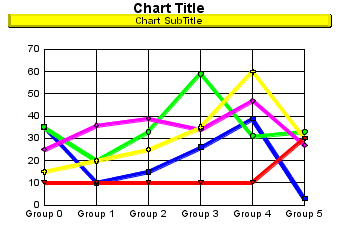
In a Java Development Environment, use the procedures in Chapter 2 to install the Perspective for Java bean into the JDE's component library. To get a chart up and viewable, simply create a new project applet window and drag the Perspective for Java bean from the component library to the new applet window. The default graph type (a vertical bar chart) using sample data is shown in the applet window.
For HTML development, use one of the sample .HTML files provided in the samples section of the download page. These example .HTML files illustrate how to develop simple bar, bi-polar, and pie charts. Use the example files as a basis from which to develop your own .HTML files.
Whether you use HTML or JAVA development depends on the development tools that are available on your system. For HTML or JAVA development, you must use at least a Java 1.1 compliant browser. See Chapter 4 for information about the methods and properties that are available for HTML development. See Chapter 5 for information about using Perspective for Java in a Java Development Environment.
Properties can be used to assign a single value to one or more objects in a chart. All properties can be used as methods by assigning a "set" or "get" prefix to the property name. Most methods are overloaded and allow you to select an object in a chart by its Object ID, sequentially with an integer value, or according to the currently selected object.
In either development environment (a JDE or Browser), use the GraphType property to select and display a particular chart type. Example:
/* Set the graph type to Pie */
perspective1.setGraphType (55); |
The following graph types can be selected with the GraphType property.
GraphType Values
Chart Category
0...16, 116, 117
3D
17...23
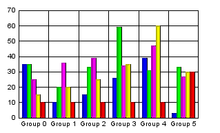
Vertical Bar
24...30
Horizontal Bar
31...35
Vertical Area
36...40
Horizontal Area
41...47
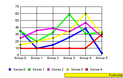
Vertical Line
48...54
Horizontal Line
55...60
Pie
61...64
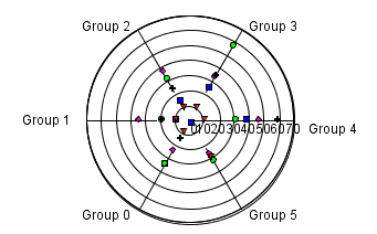
Scatter
65...66
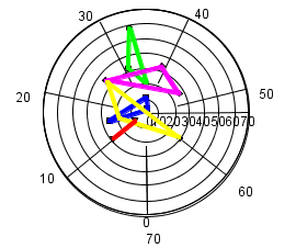
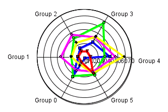
Polar
67...69
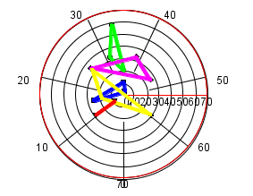
Radar
70...84 & 88
Stock
85...86
Histograms
87
Spectral Map
89...92
Bubble Charts
93...94
Pie-Bar Charts
99
Gantt Chart
100...101
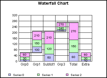
Waterfall Charts
102
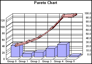
Pareto Chart
103...105
Multi-Y Axes Charts
106
Funnel Chart
110
Gauge Chart
See Appendix A for a complete list of chart types and an illustration of each chart using sample data.
These methods can be used to determine the chart type that is currently selected:
- isChart3DType(); This method returns true or false indicating whether or not the GraphType property is currently set to a value in the range: 0...7, 9, 10, or 12...14 (a 3D chart).
- isChartBiPolar(); This method returns true or false indicating whether or not the GraphType property is currently set to a bi-polar chart type (i.e., 21 (Vertical Bi-Polar Clustered Bars), 22 (Vertical Bi-Polar Stacked Bars), etc.).
- isChartBLAType(); This method returns true or false indicating whether or not the GraphType roperty is currently set to a Bar, Line, or Area chart type (i.e., 17...54).
- isChartDualY(); This method returns true or false indicating whether or not the GraphType property is currently set to a dual Y-axes chart type (e.g., 19 (Vertical Dual-Axis Clustered Bars), 20 (Vertical Dual-Axis Stacked Bars), etc.).
- isChartOrientHorz(); This method returns true or false indicating whether or not the GraphType property is currently set to a horizontally-oriented chart type (e.g., 24 (Horizontal Clustered Bars), 25 (Horizontal Stacked Bars), etc.).
- isChartPieType(); This method returns true or false indicating whether or not the GraphType property is currently set to a pie chart type (i.e., 55...60).
- isChartScatter(); This method returns true or false indicating whether or not the GraphType property is currently set to a scatter chart type (i.e., 61...64).
- isChartStockType(); This method returns true or false indicating whether or not the GraphType property is currently set to a stock chart type (i.e., 70...84 or 88).
Unless otherwise specified, an internal set of default properties determines how charts are initially imaged. The following paragraphs describe the default chart size and how the basic chart types are drawn using the default properties.
ALSO SEE:
When a chart is initially imaged, it is drawn using the Perspective minimum size (100, 100) -- approximately a 1-inch by 1-inch square.
Perspective expects the programmer or the container's layout manager to use the standard JAVA setSize() and/or setBounds() methods to set the size required by the application or container in which it is used. This allows the Perspective component to be instantiated and mixed with other components without disrupting the sizing issues required by the container or other components within the container.
You can use the Perspective getMinimumSize() method to determine the minimum size of Perspective.
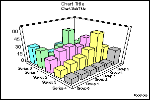
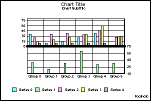
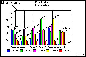
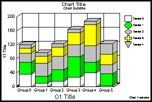
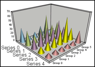
For all 3D charts, the graph is imaged using Viewing3DAnglePreset (1) -- standard. This images the chart with the labels for the ordinal axes (O1 (Groups) and O2 (Series)) on the bottom of the chart and labels for the numeric (Y1) axis on the left side as shown in the following illustration:
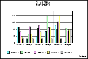
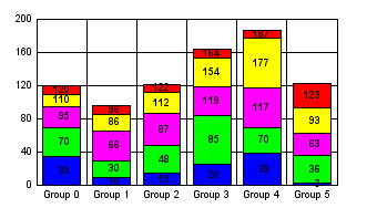
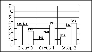
For single axis, vertical charts, the default properties image the ordinal (O1) axis on the bottom of the chart and numeric (Y1) axis on the left side chart. The series labels are drawn in the legend area at the bottom of the chart as shown in the following illustration:
For all vertical and horizontal charts, automatic shading of risers and a 2.5 effect (DepthRadius and DepthThickness) is applied to the graph.
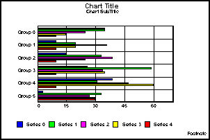
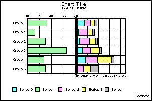
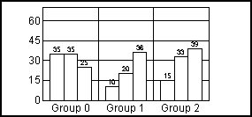
For single axis, horizontal charts, the default attributes image the ordinal (O1) axis on the left side of the chart and numeric (Y1) axis on the bottom side of the chart as shown in the following illustration:
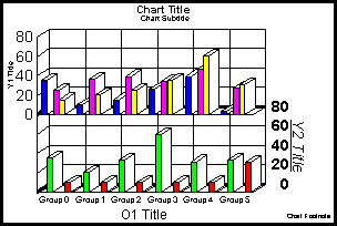
For dual axes and bipolar vertical charts, the Y1 axis is imaged on the left side of the chart and the Y2 axis is drawn on the right side as shown in the following illustration:
For dual axes and bipolar horizontal charts, the Y1 axis is drawn on the bottom of the chart and the Y2 axis is imaged on the top chart as shown in the following illustration:
A dual-axes line is drawn dividing the two halves of the chart. The default dual-axes split position is 50.
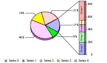
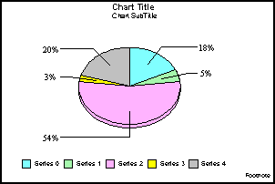
Pie charts are drawn with pie feelers and labels, the PieDepth set to 30, and the PieTitle set to 10. If a multiple pie graph type is used, the chart is imaged with two pies per row. The pie feeler text format is set to zero (standard) so that the actual value that make of the pie slice is displayed. All groups in a series are combined to form a single pie slice.
The chart legend area at the bottom of the chart shows the series labels.
When GraphType (93) is selected, Perspective maps a series/slice in a pie chart to a bar attached to the pie. The bar shows the values of the groups that form the slice:
You can use the PieBarSeries property to select the series in the pie chart that will be used to draw the bar. The default pie bar series is zero.
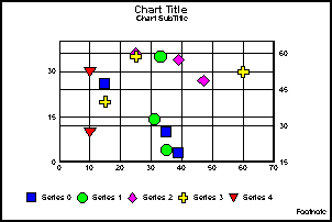
For scatter charts, the X1 axis is drawn on the bottom of the chart and the Y1 axis is drawn on the left side of the chart. If a dual axes scatter chart is selected, the Y2 axis is drawn on the right side of the chart:
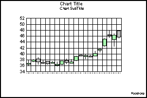
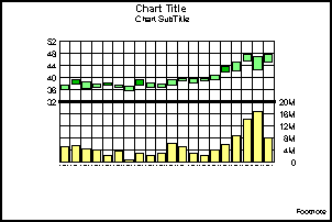
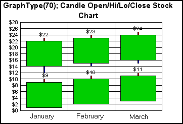
The High/Low Stock, Candle graph is a "Japanese" style stock chart. Risers are defined by open and close values. Ticks poke out from the top and bottom for high and low values. The bars will be one color if the close value is greater than the open value. Another color is used if the open value is greater than the close.
In stock charts, green risers show high values and blue risers show low values. If single axis stock charts, the Y1 axis is drawn on the left side of the chart and the O1 axis is drawn on the bottom of the chart. For dual-axes and bi-polar stock charts, the Y1 axis is drawn on the left and the Y2 axis is drawn on the right side.
If close values are included in the chart, a line is drawn in the riser at the close value. If volume values are included, the volumes are shown in the bottom of the chart on the Y2 axis and high, low, open, and/or close values are shown in the top of the chart.
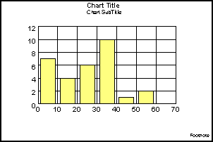
The vertical histogram is drawn with the X1 axis at the bottom of the chart and the Y1 axis on the left side as shown in the following illustration. If a horizontal histogram is used, the Y1 axis is drawn at the bottom of the chart and the X1 axis along the left side.
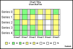
The spectral map chart type is a row or column matrix of markers that are colored according to data values. The default chart with sample data draws the O2 (series) axis labels on the left side of the chart and the O1 (group) axis labels at the bottom of the chart as shown in the following illustration:
In a Spectral Map, the risers are colored by height (rather than by series or by group). The charting engine chooses the color of quantative data representations based on the data values supplied to the chart. You can use the getColorByHeight() and gradient methods to modify the gradient.
Perspective includes four types of bubble charts: Single axis chart with and without labels and Dual axes chart with and without labels. In the default configuration the Y1 axis labels are drawn on the left side of the chart and the X1 axis labels are drawn at the bottom of the chart. Three quadrant lines are drawn for the Y1 axis and two quadrant lines are drawn for the X1 axis as shown in the following illustration:
When a chart draws a large data set or contains lengthy labels and titles, chart objects may overlap and obsecure objects behind them. In the following example, the ordinal axis/group labels and series labels are long and overlap each other.
The chart layout manager can automatically correct this problem with a single property.
Additionally, Perspective includes methods that allow you to enable/disable and define how automatic chart layout is done for individual objects.
The Place property enables/disables the automatic chart layout manager. This functionality allows you to automatically setup the spacing of various elements of a chart. Prior to drawing a chart, certain Perspective methods may be set depending on what the automatic chart layout manager determines the optimum chart to be.
When setPlace (true) is used, you can use the following methods to further control automatic placement of chart elements:
- setPlaceAlign(); For any text object, allow/disallow horizontal alignment. By default, horizontal alignment is allowed.
- setPlaceMargin(); Define the margin to draw around the entire chart. The default value is default new Rectangle (-15500, -15500, 31000, 31000).
- setPlaceMaxNumWordWrapLines(); For any text object, define the maximum number of lines that can be wrapped when setPlaceWordWrap() is enabled. The default value is 2.
- setPlaceMinFontSize(); For any text object, define the minimum font size that can be used by the automatic chart layout manager to resize a text object. The default value is 4 point.
- setPlacePosition(); Define how the automatic chart layout manager can position objects. In the current implementation, only the legend object can be repositioned. The default value is zero.
- setPlaceRect(); Set the rectangle to be used for initial placement of objects. In the current implementation, only object IDs return by getPlaceVertO1LabelsTitle() or getPlaceHorzO1LabelsTitle() can be used.
- setPlaceResize(); For any chart object, allow/disallow the automatic chart layout manager to move/resize the object. By default, resizing of all chart objects is allowed.
- setPlaceRotate(); For any text object, allow/disallow the automatic chart layout manager to rotate the object. By default, rotation is allowed for all text objects.
- setPlaceSkip(); For primary ordinal axis (O1) labels, allow/disallow the automatic chart layout manager to skip labels. By default, label skipping is allowed.
- setPlaceTruncateCount(); For any text object, set the number of characters that can be truncated.
- setPlaceWordWrap(); For any text object, allow/disallow word wrapping. By default, word wrapping is allowed.
The following properties also affect the functionality of the automatic chart layout manager:
- BuildDefaultCube; Enable/disable building the default cube in 3D charts.
- DrawNextTimeWithoutRisers; Enable/Disable recalculation of risers when a chart is drawn.
NOTES:
- For funnel, radar, and polar charts, the automatic chart layout manager (enabled by setPlace (true)) will remove the chart frame with setTransparentBorderColor (getFrame(), true).
- Automatic chart layout is not supported for Waterfall charts.
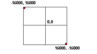
All charts are drawn using a virtual coordinate system. Regardless of the type of screen or printer device, the chart is created using the virtual coordinate system. The following illustration is a diagram of the virtual coordinates system:
The virtual coordinates are converted to device coordinates when an object is drawn on the device. Some objects in a chart can be resized and relocated using the setRect() method. The size of some objects in a chart is calculated at run-time by the charting engine and cannot be changed.
These properties and methods control the overall appearance and look of the chart:
- BiDirectional (true/false)
- GraphType (0...117)
- ManualRedraw (true/false)
- UseSampleData (true/false)
- UseOffScreen (true/false)
- PrimitiveAntialiasing (true/false)
- TextAntialiasing (true/false)
The BiDirectional property reverses the text alignment of all objects and the location of legend text next to label markers. This property is provided for international support ONLY! It can be used to make the entire chart read from right-to-left (BiDirectional (true)) or left-to-right (BiDirectional (false)). However, note that BiDirectional (true) does not reverse the values of the associated properties and methods. They retain their original values. For example, getTextJustHoriz() would return zero (left) even though visually the text is aligned right by BiDirectional (true). Use this property with great care! Your application must keep track of the BiDirectional setting and handle the reverse values supplied by associated properties and methods.
The GraphType property selects the type of graph (e.g, 3D, Vertical Bar, Pie, Stock, etc.) to be drawn. Appendix A includes an example of each of the graph types that Perspective supports.
The ManualRedraw property enables (true) / disables (false) manual redrawing of the chart when the chart properties/attributes are changed. The default value is false so that the chart is always automatically redrawn when chart properties change.
The UseSampleData property enables (true) / disables (false) the use of a sample data in a chart. Different sets of data are included in TDGDataSampler .class for use with the various graph types. This data can be used to show how various graph types are imaged using typical data that might be included in the chart. See "The Data Interface" for methods that can be used to import your own data in a chart. Chapter 6 contains additional information about including your own data in a chart.
The UseOffScreen property controls whether the chart will be drawn directly to the graphics device (true) or using an off-screen image buffer (false). Set this property to false when the drawing speed of the chart seems very slow. When this property is set to false, it can increase the drawing speed by a factor of three in some situations.
The PrimitiveAntialiasing and TextAntialiasing properties enable (true) / disable (false) drawing of the chart and chart text objects with smoother lines using Java 2D.
The chart frame is the outer edge of the chart on which gridlines and risers (bar, area, markers) are drawn.
These properties and methods define how the chart frame is imaged:
- FrameDisplay (True/False)
- DepthAngle (0...360)
- DepthRadius (0...100)
The FrameDisplay property enables (true)/disables (false) display of the chart frame text string. The default value is True.
To draw a chart frame with a 2.5D effect as shown in this example, use the DepthAngle and Depth Radius properties to set the angle and radius of the 2.5D effect. This example chart frame was drawn with the default values DepthAngle (45) and DepthRadius (25).
Depending on the graph type, the chart may include one or two ordinal axes (O1 and O2) and multiple numeric axes (X1, Y1, Y2, Y3, Y4, Y5). The following illustration shows a chart with one ordinal axis (O1) and two numeric axes (Y1 and Y2). Note that the secondary ordinal axis (O2) only appears in 3D charts.
An O1 (group or category) axis is included in all chart types except bubble, histogram and scatter charts.
ALSO SEE:
Using Data in Your Chart/Time Scale Axis Charts for information about how to set up a time scale axis.
The following table shows the default values for properties that affect these axes and their grid lines, labels, titles, etc. Blank cells indicate the property is not supported or applicable for the axis:
Property
O1 Axis
O2 Axis (See Note 1)
X1 Axis
Y1 Axis
Y2 Axis
Y3/Y4/Y5 Axis
AxisDescending
false
false
false
false
AxisLineDisplay
true
true
true
true
AxisSide
0
0
See Note 2
See Note 2
ExcludeMaxLabel
false
false
false
false
false
ExcludeMinLabel
false
false
false
false
false
LabelAutofit
true
true
true
false
true
LabelAutoskip
0
LabelDisplay
true
true
true
true
true
LabelFormat
0
0
0
LabelFormatPattern
"#.#"
"#.#"
"#.#"
LabelMargin
0
LabelRotate
0
0
0
0
0
LabelSkipBegin
0
LabelSkipCount
0
LabelStagger
false
false
false
false
LogScale
false
false
false
false
LabelWrap
false
false
MajorGridDisplay
true
true
true
true
true
MajorGridStep
10.0
10.0
10.0
MajorGridStepAuto
true
true
true
MajorGridStyle
0
0
0
0
MinorGridCount
1
MinorGridDisplay
false
false
false
false
MinorGridStep
10.0
10.0
10.0
MinorGridStepAuto
true
true
true
MinorGridStyle
0
0
0
0
MajorTickDisplay
false
false
false
false
MajorTickStep
10.0
10.0
10.0
MajorTickStepAuto
true
true
true
MajorTickStyle
0
0
0
0
MinorTickDisplay
false
false
false
false
MinorTickStep
10.0
10.0
10.0
MinorTickStepAuto
true
true
true
MinorTickStyle
0
0
0
0
MustIncludeZero
false
false
false
OffScaleDisplay
true
true
true
ScaleMax
100.0
70.0
80.0
ScaleMaxAuto
true
true
true
ScaleMin
0.0
0.0
0.0
ScaleMinAuto
true
true
true
TitleAutofit
true
true
true
true
true
TitleDisplay
false
false
false
false
false
TitleString
Null String
Null String
Null String
Null String
Null String
ZeroLineDisplay
false
false
false
false
NOTES:
- The O2-Axis only appears in 3D Charts and Spectral Maps. Grid3DFloorDisplayX/Z, Grid3DLeftWallDisplayY/Z, Grid3DRightWallDisplayX/Y, and Grid3DRiserDisplayX/Y/Z enable/disable the display of grid lines in a 3D chart.
- For dual (Y1/Y2) axes charts, the default AxisSide is 0 (left) for the Y1 axis and 1 (right) for the Y2-axis. For charts with more than two Y-axes, the default AxisSide is 0 (left) for odd numbered axes (Y1, Y3, Y5) and 1 (right) for even numbered axes (Y2, Y4).
Use these properties to define how ordinal axis are imaged in the chart:
- O1AxisLineDisplay (true/false); This property enables (true) / disables (false) the display of the base line on the primary ordinal axis.
- O1AxisSide (0...3); This property controls which side of the graph the ordinal axis is imaged. Although the vast majority of all graphs will image their ordinal text on the bottom of a vertical chart or left of a horizontal chart, it is possible to image it to the top/right or both sides. The default value is 1 (bottom for vertical charts/left for horizontal charts).
Also see "Labels and Titles" and "Grid Lines" for additional information about how to control the display of labels and titles on an ordinal axis.
Use these methods to determine if the chart includes the primary or secondary ordinal axis:
- isO1AxisPresent(); This method returns true or false indicating whether or not the primary ordinal axis is present in the chart.
- isO2AxisPresent();This method returns true or false indicating whether or not the secondary ordinal axis is present in the chart.
These properties indicate whether or not the axis is present regardless of whether or not the axis base line is enabled for display. The primary ordinal axis is present in most graph types. The secondary ordinal axis is only present in 3D graph types.
Use these properties to define how numeric axes are imaged in the chart:
- X1/Y1/Y2/Y3/Y4/Y5AxisDescending (True/False)
- X1/Y1/Y2AxisLineDisplay (true/false)
- X1/Y1/Y2AxisSide (0...2)
- X1/Y1/Y2OffScaleDisplay (True/False)
- X1/Y1/Y2/Y3/Y4/Y5LogScale (True/False)
- X1/Y1/Y2ScaleMax (Double)
- X1/Y1/Y2ScaleMaxAuto (True/False)
- X1/Y1/Y2ScaleMin (Double)
- X1/Y1/Y2ScaleMinAuto (True/False)
- X1/Y1/Y2/Y3/Y4/Y5ZeroLineDisplay (True/False)
- X1/Y1/Y2MustIncludeZero (True/False)
Use the AxisDescending properties to change the direction of values displayed on the axis to descending or ascending. The default value is True (ascending values).
The AxisLineDisplay properties enable (true) / disable (false) the display of the bottom line on an axis.
The AxisSide properties control the side of the chart where the axis is imaged. For vertical charts, the default settings draw the Y1 axis on the left side of the chart and the Y2 on the right. For horizontal charts, Y1 is drawn on the bottom of the chart and Y2 on the top.
The LogScale properties specify the scale (logarithmic or linear) for the numeric axis. The default value is False (linear).
The OffScaleDisplay properties determine whether or not values out of range are imaged on the axis.
The ScaleMin and ScaleMax properties define the range (minimum and maximum) of values that will be imaged on the axis. The ScaleMinAuto and ScaleMaxAuto properties tell the charting engine to automatically calculate the minimum and maximum values. If these properties are enabled (set true), values set by ScaleMin and ScaleMax are ignored.
The ZeroLineDisplay properties enable/disable drawing of a zero line on an axis. The default value is true (the zero line is drawn).
The MustIncludeZero properties determine whether or not the numeric axes includes zero. The default value is false.
Also see "Labels and Titles" for additional information about how to control the display of labels and titles on a numeric axis.
Use these methods to get information about specific numeric axes in a chart:
- getX1MajorGridStepAutoValue(); If major grid steps are automatically calculated, this method returns the grid step value for the X-axis.
- getX1ScaleMaxAutoValue(); If the maximum scale value is automatically calculated, this method returns the maximum scaling value that will be used on the X-axis.
- getX1ScaleMinAutoValue(); If the minimum scale value is automatically calculated, this method returns the minimum scaling value that will be used on the X-axis.
- getY1MajorGridStepAutoValue(); If major grid steps are automatically calculated, this method returns the grid step value for the Y1-axis.
- getY1ScaleMaxAutoValue(); If the maximum scale value is automatically calculated, this method returns the maximum scaling value that will be used on the Y1-axis.
- getY1ScaleMinAutoValue(); If the minimum scale value is automatically calculated, this method returns the minimum scaling value that will be used on the Y1-axis.
- getY2MajorGridStepAutoValue(); If major grid steps are automatically calculated, this method returns the grid step value for the Y2-axis.
- getY2ScaleMaxAutoValue(); If the maximum scale value is automatically calculated, this method returns the maximum scaling value that will be used on the Y2-axis.
- getY2ScaleMinAutoValue(); If the minimum scale value is automatically calculated, this method returns the minimum scaling value that will be used on the Y2-axis.
- isX1AxisPresent(); This method returns true or false indicating whether or not the X-axis is prsent in the chart.
- isY1AxisPresent();This method returns true or false indicating whether or not the primary numeric axis is prsent in the chart.
- isY2AxisPresent();This method returns true or false indicating whether or not the secondary numeric axis is prsent in the chart.
- isZ1AxisPresent();This method returns true or false indicating whether or not the Z-axis is present in the chart.
These methods indicate whether or not the axis is present regardless of whether or not the axis base line is enabled for display. The X1-axis is present in scatter charts, bubble charts, histograms, etc. The Y1-axis is present in most graph types. The Y2-axis is only present in dual-axes charts.
In addition to the axis-specific properties and methods described above, these methods can be used to get and set axis attributes.
- get/setAxisAssignment(); Get/set the axis assignment to determine where a series is assigned to an axis.
- get/setAxisDescending(); Get/set the order (ascending or descending) in which an axis is drawn.
- get/setAxisOffset(); Get/set axis offset in Multi-Y charts.
- get/setAxisSide(); Get/set the side of the chart where an axis is imaged.
- get/setAxisSize(); Get/set the size of an axis in Multi-Y charts.
- get/setDisplayOffscale(); Get/set whether or not off-scale values are drawn on an axis.
- get/setLogScale(); Get/set whether the axis uses linear or logarithmic scaling
- get/setLogScaleBase(); Get/set the scale base when logarithmic scaling is used on a numeric axis.
- get/setScaleMax(); Get/set the maximum value imaged on an axis.
- get/setScaleMaxAuto(); Get/set automatic calculation of the ScaleMax value.
- get/setScaleMin(); Get/set the minimum value imaged on an axis.
- get/setScaleMinAuto();Get/set automatic calculation of the ScaleMin value.
- get/setScaleMustIncludeZero(); Get/set whether or not the axis must include a zero value.
When these methods are used, the object ID of an axis may be supplied as an input parameter to identify the axis where the attribute is applied. See "Getting an Object ID" for methods that can be used to get an object ID. If an axis is not specified, the attribute is retrieved from or assigned to the first item in the selection list. If the object ID does not identify an axis or the first item in the selection list is not an axis, a "set" operation will apply the attribute to the object but it will not affect the appearance of the chart.
These properties control the axes in dual-axes charts:
- DualAxisLineDisplay (True/False); This property enables (true) / disables (false) the display of a line that separates the two halves of a dual axes chart.
- DualAxisSplitPosition (0...100); This property sets the position within the chart frame where the Dual-Y split position will be created.
When a multi-Y axis chart type is selected with setGraphType(103), setGraphType(104), or setGraphType(105), the following properties can be used to specify the format of the Y3, Y4, and Y5 axes:
- Y3AxisDescending; Make the Y3 axis ascending or descending.
- Y3LogScale; Make the Y3 axis linear or logarithmic scale.
- Y3ZeroLineDisplay; Show/hide the zero line on the Y3 axis.
- Y4AxisDescending; Make the Y4 axis ascending or descending.
- Y4LogScale; Make the Y4 axis linear or logarithmic scale.
- Y4ZeroLineDisplay; Show/hide the zero line on the Y4 axis.
- Y5AxisDescending; Make the Y5 axis ascending or descending.
- Y5LogScale; Make the Y5 axis linear or logarithmic scale.
- Y5ZeroLineDisplay; Show/hide the zero line on the Y5 axis.
The Axis Independent Methods can also be used to configure the Y3, Y4, and Y5 axes.
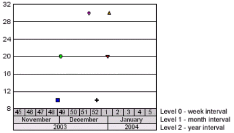
A time scale axis uses time to display data. A time scale axis can be defined in bar, line, area, scatter, and stacked bar charts. The following properties and methods handle functionality that is specific to a time scale axis:
- MajorGridTickInterval; Define major grids/ticks on interval (seconds to years) boundaries.
- MinorGridTickInterval; Define minor grids/ticks on interval (seconds to years) boundaries.
- Quarter1StartMonth; Define the first quarter start month.
- UseTimeScaleAxis; Enable/disable time scale axis.
- get/setLevelDateFormat(); Get/set the date format of a level.
- get/setLevelFillColor(); Get/set the fill color of a level
- get/setLevelHeight(); Get/set the height of a level in virtual coordinates.
- get/setLevelInterval(); Get/set the time interval of a level.
- get/setLevelTextFormat(); Get/set the text format of a level.
- setLevelBorderColor(); Set the border color of a level.
- setLevelTextColor(); Set the text color of a level
- setTimeScaleAxisDefaults() is an optional method that can be called to set a time scale axis chart to default values before other properties and methods are set.
In time scale axis charts, it is often useful to represent data with several intervals. Three intervals can be shown simultaneously on a time axis scale. The following example shows weeks, months, and years.
Levels must be set in increasing order. Level 1 must be greater than Level 0 (e.g., Level 0 = TIME_INTERVAL_WEEKS (5), Level 1 = TIME_INTERVAL_MONTHS (6)). Level 2 must be greater than Level 1 (e.g., Level 1 = TIME_INTERVAL_MONTHS (6), Level 2 = TIME_INTERVAL_YEARS (8)). In this example, the following methods were used to set the level intervals:
setLevelInterval(0, Interval.TIME_INTERVAL_WEEKS);
setLevelInterval(1, Interval.TIME_INTERVAL_MONTHS);
setLevelInterval(2, Interval.TIME_INTERVAL_YEARS);The following time intervals can be specified in a time scale axis chart:
TIME_INTERVAL_UNDEFINED = 0
TIME_INTERVAL_SECONDS = 1
TIME_INTERVAL_MINUTES = 2
TIME_INTERVAL_HOURS = 3
TIME_INTERVAL_DAYS = 4
TIME_INTERVAL_WEEKS = 5
TIME_INTERVAL_MONTHS = 6
TIME_INTERVAL_QUARTERS = 7
TIME_INTERVAL_YEARS = 8Each level can be formatted independently using properties and methods that can be applied to any other label object (e.g. font size, font color, word wrap, anti-alias, etc.).
The setLevelTextFormat() method defines how time axis scale labels are drawn.
IIntervalScale.FORMAT_SHORT = 0
IIntervalScale.FORMAT_MEDIUM = 1
IIntervalScale.FORMAT_LONG = 2
IIntervalScale.FORMAT_RAW = -1The format in which text is drawn depends on the interval set by setLevelInterval(). The following table shows how each text format is represented for each level:
FORMAT_SHORT
FORMAT_MEDIUM
FORMAT_LONG
TIME_INTERVAL_SECONDS
1
Sec 1
Second 1
TIME_INTERVAL_MINUTES
1
Min 1
Minute 1
TIME_INTERVAL_HOURS
1
Hour 1
Hour 1
TIME_INTERVAL_DAYS
1
Day 1
Day 1
TIME_INTERVAL_WEEKS
1
Week 1
Week 1
TIME_INTERVAL_MONTHS
1
Mon 1
Month 1
TIME_INTERVAL_QUARTERS
1
Q 1
Quarter 1
TIME_INTERVAL_YEARS
1
01
2001
If setLevelTextFormat() selects FORMAT_RAW, you can specifically define how date and time text is formatted using setLevelDateFormat() and the standard Java SimpleDateFormat codes.
Letter
Date/Time Componenet
Presentation
Example
G
Era Designation
Text
AD
y
Year
Year
2004, 04
M
Month in year
Month
March, Mar., 03
w
Week in year
Number
1...52
W
Week in month
Number
2
D
Day in year
Number
1...365
d
Day in month
Number
10
F
Day of week in month
Number
2
E
Day in week
Text
Tuesday, Tue
a
AM/PM Marker
Text
PM
H
Zero-Based Hour in day
Number
0...23
k
Hour in day
Number
1...24
K
Zero-Based Hour in AM/PM
Number
0...11
h
Hour in AM/PM
Number
1...12
m
Minute in hour
Number
30
s
Second in minute
Number
55
S
Millisecond
Number
978
z
Time Zone
General time zone
Pacific Standard Time, PST, GMT-08:00
Z
Time Zone
RFC 822 Time Zone
-0800
Examples:
If the date/time is July 4, 2001 12:08:56 local time in the U.S. Pacific Time zone, the following examples show how date/time patterns are interpreted in the U.S. locale:
setLevelTextFormat(FORMAT_RAW);
setLevelDateFormat("yyyy.MM.dd G 'at' HH:mm:ss z");2001.07.04 AD at 12:08:56 PDT
setLevelTextFormat(FORMAT_RAW);
setLevelDateFormat("EEE, MMM d, ''yy");Wed, Jul 4, '01
setLevelTextFormat(FORMAT_RAW);
setLevelDateFormat("hh 'o''clock' a, zzzz");12 o'clock PM, Pacific Daylight Time
setLevelTextFormat(FORMAT_RAW);
setLevelDateFormat("yyyyy.MMMMM.dd GGG hh:mm aaa");02001.July.04 AD 12:08 PM
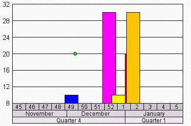
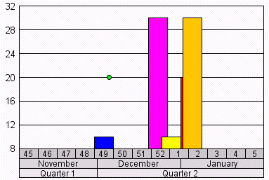
If a time scale axis spans multiple quarters (setLevelInterval(n, Interval.TIME_INTERVAL_QUARTERS);), the Quarter1StartMonth property can be used to define the starting month of the first quarter. Example:
setQuarter1StartMonth(1); January
setQuarter1StartMonth(9);
September
The following methods must be used to set the starting and ending date boundaries of a time scale axis:
void setStartDate(double newValue);
void setEndDate(double newValue);The sample data sets provided with Perspective are not suitable for a time scale axis. The UseSampleData property must be set to false and the setData() method must be used to define dates/times and data to be charted. Each data point to be charted requires two values: a date/time specification and a value. See "Time Scale Axis Charts" in Chapter 6 for more information about the data that is required for a time scale axis.
Use these methods to define how axis text is autofitted:
- AxisTextAutofitMax (value); This property defines the maximum size of axis text in virtual coordinates.
- AxisTextAutofitMin (value); This property defines the minimum size of axis text in virtual coordinates.
- AxisTextAutofitMode (0...2); This property defines the mode to be used for autofitting axis text.
- AxisTextAutofitPercent (0...100%); When AxisTextAutofitMode is set to two, this property defines the percent to be used for autofitting axis text. All Axis text is maintained within AxisTextAutofitPercent of the axis with the smallest font size as determined by Autofit.
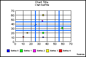
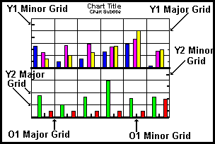
Each axis in a chart can include/exclude major and minor grid lines. Properties and methods also allow you to specify the number and style of grid lines on each axis. The following illustration shows a bi-polar chart where major and minor grid lines have been enabled on the ordinal (O1) axis and both numeric (Y1 and Y2) axes:
Use these properties to control the grid lines on the ordinal axis:
- O1MajorGridDisplay (True/False)
- O1MajorGridStyle (0...5)
- O1MinorGridCount (0...50)
- O1MinorGridDisplay (True/False)
- O1MinorGridStyle (0...5)
These properties control the number, display, and style of ordinal axis major and minor grid lines. Major and minor grid lines can be displayed in one of the following styles:
0=No grid lines
1=Normal grid lines, height of frame
2=Normal grid lines extended beyond the height of frame
3=Small tick marks from frame edge inward
4=Small tick marks from frame edge outward
5=Ticks span across the frame edge
All charts can include major and minor grid lines. In the default configuration, major grid lines are drawn and minor grid lines are not drawn. Different styles can be assigned to major and minor grid lines so that they are easily distinguished in the chart.
Use these methods to control the appearance of grid lines on the numeric axes in a chart.
- X1/Y1/Y2MajorGridDisplay (True/False)
- X1/Y1/Y2MajorGridStyle (0...5)
- X1/Y1/Y2MajorGridStep (double)
- X1/Y1/Y2MajorGridStepAuto (true/false)
- X1/Y1/Y2MinorGridDisplay (True/False)
- X1/Y1/Y2MinorGridStyle (0...5)
- X1/Y1/Y2MinorGridStep (double)
- X1/Y1/Y2MinorGridStepAuto (true/false)
The GridDisplay properties control the display of major and minor grid lines on a numeric axes. The default value is true for major grid lines and false for minor grid lines. The GridStyle properties select the style of numeric axes grid lines:
0=No grid lines
1=Normal grid lines, height of frame
2=Normal grid lines extended beyond the height of frame
3=Small tick marks from frame edge inward
4=Small tick marks from frame edge outward
5=Ticks span across the frame edge
Typically different styles are used for major and minor grid lines so that they are easily distinguished in the chart.
The GridStep and GridStepAuto properties control the number of numeric axis grid lines according to the number of values displayed on an axis. If the GridStepAuto property is enabled, the number of grid steps is automatically calculated and the value assigned to the associated GridStep property will be ignored. If the GridStepAuto property is disabled, the GridStep property controls the number of major or minor grid lines that will be imaged. For example, grid steps 1, 6, 11, 16...51 will be imaged if the range of values in the chart is 1...51 and this property is set to 5. If this property is set to 10, grid steps 1, 11, 21, 31...51 would be displayed.
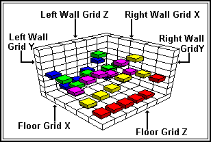
Grid lines can be displayed on the floor and walls of the cube in 3D graphs as shown in the following illustration:
The following properties enable and disable these grid lines:
- Grid3DFloorDisplayX/Z (True/False); These properties show/hide X-axis and Z-axis grid lines on the floor of the cube.
- Grid3DLeftWallDisplayY/Z (True/False); These properties show/hide Y- and Z-axis grid lines on the left wall of the cube.
- Grid3DRightWallDisplayX/Y (True/False); These properties show/hide X- and Y-axis grid lines on the right wall of the cube.
Grids can also be displayed on risers in 3D graphs using these properties:
- Grid3DRiserDisplayX (True/False); This property enables/disables the display of X-axis grid lines on risers in a 3D-surface chart. It is only applicable when a 3D-surface chart is selected.
- Grid3DRiserDisplayY (True/False); This property enables/disables the display of Y-axis grid lines on risers in a 3D chart.
- Grid3DRiserDisplayZ (True/False); This property enables/disables the display of Z-axis grid lines on risers in a 3D-surface chart. It is only applicable when a 3D-surface chart is selected.
In addition to the axis-specific grid properties described above, these methods can be used to get and set grid attributes.
- get/setGridCount(); Get/set the number of grid lines on an axis.
- get/setGridStep(); Get/set the number of grid steps on an axis
- get/setGridStepAuto(); Get/set whether grid steps are automatically calculated on an axis.
- get/setGridStyle(); Get/set the style of grid lines to be imaged on an axis
- setGridAttributes(); This method can be used to set the color, style, width, and stroke of gridlines (major and minor) for a specified axis.
When these methods are used, the object ID of a grid may be supplied as an input parameter to identify the grid to which the attribute is applied. See "Getting an Object ID" for the methods that can be used to get the object ID of a grid. If a grid is not specified, the attribute is retrieved from or assigned to the first item in the selection list. If the object ID does not identify a grid object or the first item in the selection list is not a grid object, a "set" operation will apply the attribute to the object but it will not have any effect on the appearance of the chart.
Tick marks can be enabled on any axis independent of grid lines. The following properties control drawing of tick marks on the primary ordinal axis:
The following properties control drawing of independent tick marks on a numeric axis:
Note that tick marks can be drawn on Y3-, Y4-, and Y5-axes using the methods listed below.
The following methods can be used to enable and control the appearance of independent tick marks on O1-, X1- and all Y-axes:
- get/setTickCount(); Get/set the number of minor ticks to draw between major ticks.
- get/setTickLength(); Get/set the length of tick marks in virtual coordinates.
- get/setTickStep(); Get/set the number of tick steps on an axis when setTickStepAuto (FALSE) is used.
- get/setTickStepAuto(); Enable/disable automatic calculation of the number of ticks.
- get/setTickStyle(); Get/set tick style (inside, outside, or spanning) the axis baseline.
- get/setTickWidth(); Get/set the width of tick marks in virtual coordinates.
- get/setDrawTicksPerpendicular(); Force tick marks to be perpendicular to axis base line or not.
- setMajorTickAttributes(); This method can be used to set the color, style, width, and stroke of major tick marks and to include/exclude minimum and maximum ticks.
- setTickAttributes(); This method can be used to set the color, style, width, and stroke of major and minor tick marks for a specified axis.
When these methods are used, the object ID of tick marks may be supplied as an input parameter to identify the axis tick marks to which the attribute is applied. See "Getting an Object ID" for the methods that can be used to get the object ID of tick marks. If a tick mark object is not specified, the attribute is retrieved from or assigned to the first item in the selection list. If the object ID does not identify a tick mark object or the first item in the selection list is not a tick mark object, a "set" operation will apply the attribute to the object but it will not have any effect on the appearance of the chart.
Perspective includes the following properties and methods for drawing curve fit lines across one or more series of risers:
- get/setCurveFitType(); These methods get and set a curve fit type (e.g., linear, quadratic, polynomial, etc.). The setCurveFitType() method enables drawing of the curve fit line.
- get/setCurveFitPolynomialOrder(); If setCurveFitType() selects a polynomial fit line, these methods get and set order for the polynomial fit.
- CurveFitEquationDisplay; This property enables / disables drawing of the equation associated with a curve fit line.
- CurveFitHighOrderFirst; When the CurveFitEquationDisplay property is true, this property selects the format of the equation.
- CurveFitNumSegments; This property defines the number of segments to use in drawing a curve fit line.
When Java 2D line objects are enabled with setBasicStroke (1...5), the following methods can be used to format lines in a chart:
- get/setLineBasicStrokeType(); Defines a line's basic stroke type (0 = JDK 1.1.8, 1...5 selects one of the Java 2D BasicStroke constructors).
- get/setLineCap(); Defines the decoration applied to the ends of unclosed subpaths and dash segments of a specified line as defined by the Java 2D BasicStroke object (e.g., CAP_BUTT, CAP_ROUND or CAP_SQUARE).
- get/setLineDash(); These methods define a dash pattern for a specified line object.
- getLineDashFloat(); Returns the dashing pattern as an array of floating point numbers.
- get/setLineDashPhase(); When a line dashing pattern has been specified with setLineDash(), these methods define the offset to start the dashing pattern for a specified line object.
- get/setLineJoin(); Defines the decoration applied where line path segments meet (e.g., JOIN_ROUND, JOIN_BEVEL, or JOIN_MITER)
- get/setLineMiterLimit(); When setLineJoin() applies JOIN_MITER to a line object, these methods define the limit to trim the miter join.
Also see the java.awt.BasicStroke constructors for more information about these methods.
The risers and markers in a chart are initially determined by the graph type that is selected with the GraphType property. For example, GraphType 17 selects a vertical bar chart and the risers are drawn in the chart as vertical bars that are auto-shaded and imaged with a 2.5D effect by default. GraphType 54 selects a horizontal line chart in which risers are drawn as lines that are auto-shaded and imaged with a 2.5D effect by default.
The following properties and methods can be used to change how risers and markers are imaged in the chart. Also see " Pie Chart Properties and Methods" and "Stock Chart Characteristics" for more information about the risers and markers in these graph types.
These properties control risers and markers in a chart:
- ConnectLineMarkers (True/False)
- ConnectScatterMarkers (True/False)
- CubeSquareRisers (True/False)
- DataLineThickness (1...100)
- DisplayBarAsPictograph (True/False)
- MarkerDisplay (True/False)
- MarkerSizeDefault (0...100)
- ReverseGroups (True/False)
- ReverseSeries (True/False)
- Riser3DThicknessY (0...100)
- RiserBarGroupSpacing (-100...100)
- RiserBorderMode (0...2)
- RiserWidth (0...100)
- ScaleFromZero (True/False)
- SeriesDefaultBorderColor (color)
- SeriesDefaultTransparentBorderColor (True/False)
- SeriesAreRows (True/False)
- UseSeriesBorderDefaults (True/False)
If you want the risers/markers in a chart to always be square regardless of the shape and size of a 3D cube (for example), use the CubeSquareRisers property.
In line charts where a 2.5D effect is not applied to the chart, the line risers are displayed as markers. Use the ConnectLineMarkers property to enable (true) / disable (false) the display of a line that connects the markers.
In a Scatter chart, use the ConnectScatterMarkers property to enable (true) / disable (false) the display of connecting lines between markers.
When lines are drawn between markers in a line or scatter chart, you may use the MarkerDisplay property to remove the markers from the chart and only display the connecting lines.
For a "2.5D effect" chart, the DataLineThickness property defines the thickness (in pixels) of the "fake 3D" line.
When a texture file has been loaded using setTextureURL(), the DisplayBarAsPictograph property can be used to enable the texture file image on bar risers.
Use the MarkerSizeDefault property to define the default size of markers in a 2D chart. See the get/setMarkerSize methods if you want to change the size of markers.
The Riser3DThicknessY, RiserWidth, and RiserBarGroupSpacing properties can be used to control the size of bar risers in 3D and 2D charts.
The RiserBorderMode property determines when riser borders are drawn (always, never, or only for small datasets (fewer than 900 risers)).
In applications where the data range can include negative numbers, the ScaleFromZero property determines whether the risers will be drawn pointing up and down from a zero line or whether all risers will draw straight up from the "bottom" of the graph.
The ReverseGroups, ReverseSeries, and SeriesAreRows properties can be used to control how data is assigned to risers and markers in a chart.
When UseSeriesBorderDefaults is enabled (true), riser borders will be drawn with the color defined with the SeriesDefaultBorderColor property if SeriesDefaultTransparentBorderColor is false. If SeriesDefaultTransparentBorderColor is true and UseSeriesBorderDefault is enabled, transparent borders are drawn around riser edges.
In addition to the riser-specific properties described above, these methods can be used to get and set riser and marker attributes.
- get/setMarkerShape(); Get/set the shape of markers in a series.
- get/setMarkerSize(); Get/set the size of markers in a series or series and group
- get/setSeriesType(); Get/set the type (bar, area, or marker) of a series of risers.
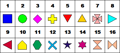
The setMarkerShape() method can be used to set the shape of markers in a chart. The following predefined shapes can be selected:
The setSeriesType() method can be used to assign a riser type to individual series. This allows you to use a different type of risers for series in a chart. For example, series one could use bar risers, series two could use line markers, and series three could use area risers.
When these methods are used, the object ID of a riser/marker may be supplied as an input parameter to identify the object to which the attribute is applied. See "Getting an Object ID" for the methods that can be used to get the object ID of markers and risers. If a riser or marker is not specified, the attribute is retrieved from or assigned to the first item in the selection list. If the object ID does not identify a riser or marker object or the first item in the selection list is not a riser or marker, a "set" operation will apply the attribute to the object but it will not have any effect on the appearance of the chart.
The following methods can be used to create custom marker shapes:
registerMarkerTemplate(); Register a user-defined marker.
setMarkerTemplate(); Assign the user-defined marker to a marker template slot.
getNextMarkerTemplateSlot(); Determine which marker is in each template slot.
In addition to the marker shapes that are provided with Perspective, you may also define your own custom marker shapes. Perspective provides a variety of predefined marker shapes that can be set with setMarkerShape() method. You may over-write any of the predefined marker shapes in template slots 1-16 or define new shapes in slots 17-32.
- Define the shape, typically as a standard Java Polygon. The polygon must fit in the rectangle: -900, -900, 1800, 1800 (i.e., the rectangle that goes from -900 to 900 in the X- and Y-directions). These are Perspective virtual coordinates.
- Register the polygon with Perspective with the following method:
Where: m_chart = the Perspective instance the caller uses to access Perspective properties and methods.
- Use the marker shape number (e.g., nNewShape) returned by registerMarkerTemplate() as the input parameter to setMarkerShape. Example:
- Perspective currently supports 32 marker shapes. It is possible to overwrite any or all of these using the following method:
- You may use the following method to determine which marker shapes are assigned to each marker template slot:
The following methods can be used to define the use of exceptional/highlighted risers in a chart.
- get/setExceptionalRiser(); These methods get and set exceptional risers at a particular series and group.
- getExceptionalRisers(); This method can be used to determine if there are any exceptional risers in a chart.
- isExceptionalAllowed(); This method can be used to determine if exceptional risers are allowed in a chart.
- setNoExceptionalRiser(); This method can be used to disallow exceptional risers in a chart.
The following properties and methods control chart legends.
These properties are used to control how the legend area, legend markers, and legend text are imaged in a chart:
- LegendAutomatic (True/False); This property enables/disables auto-fitting of text inside the legend box. The default value is True.
- LegendDisplay (True/False); This property enables/disables drawing of the legend box. The default value is True.
- LegendMarkerPosition (0...4); This property sets the location and format of the chart legends. The default value is 0.
- LegendMarkerSizeMax(); This property controls the maximum size of legend markers in virtual coordinates.
- LegendMarkersPerRow(); This property controls the number of markers per row shown in the legend area.
- LegendOrient (0...2); This property controls orientation of markers and labels in the legend area.
- LegendReverse (True/False); This property controls order of legend markers and labels.
- LegendScroll (0...2); This property controls the legend scrollbar.
- LegendSeriesCount(); When LegendScroll is enabled, the property defines the number of series to be displayed at a time in the scrolled legend area.
- LegendSeriesStart(); When LegendScroll is enabled, the property defines the first of series to be displayed in the scrolled legend area.
- LegendTextAutofit (True/False); This property enables (true) / disables (false) auto-fitting of the legend text. The default value is True.
- UseSeriesShapes (True/False); This property enables/disables the use of the shapes defined by the setMarkerShape() method. This property is ignored if the LegendMarkerPosition property sets the legend text to display on top of the legend marker.
- SquareMarkers (True/False); This property can be used to force markers in the legend area to fit in a perfectly square rectangle regardless of their shape. This property is ignored if the LegendMarkerPosition property sets the legend text to display on top of the legend marker.
These methods are used to control how the legend area, legend markers, and legend text are imaged in a chart:
- getLegendMinWidth(); This method allows a user to resize the legend so that none of the labels wrap or truncate. Note that since it specifically calculates wdith, it is applicable to Vertical legends only!
- get/setLegendRect(); These methods are used to get/set the size and location of the legend rectangle. Also see "Virtual Coordinates" for additional information about the virtual coordinates system.
The titles and labels that are included in the chart consist of the chart-wide titles (footnote, title, and subtitle) and ordinal and numeric axis labels and titles. All labels and titles can be defined, displayed, and auto-fitted using the properties and methods described below.
These properties are used to define, display, and auto-fit the chart title, subtitle, and footnote.
- FootnoteAutofit (true/false)
- FootnoteDisplay (true/false)
- FootnoteString (String)
- SubtitleAutofit (true/false)
- SubtitleDisplay (true/false)
- SubtitleString (string)
- TitleAutofit (true/false)
- TitleDisplay (true/false)
- TitleString (string)
These properties can be used to control the appearance of labels and titles on an ordinal axis:
- O1/O2ExcludeMaxLabel (true/false)
- O1/O2ExcludeMinLabel (true/false)
- O1/O2LabelAutofit (true/false)
- O1LabelAutoskip (0...2)
- O1/O2LabelDisplay (true/false)
- O1/O2LabelRotate (0...2)
- O1LabelStagger (true/false)
- O1/O2LabelWrap (true/false)
- O1LabelSkipBegin (value)
- O1LabelSkipCount (value)
- O1/O2TitleAutofit (true/false)
- O1/O2TitleDisplay (true/false)
- O1/O2TitleString (String)
The ExcludeMinLabel and ExcludeMaxLabel properties can be used to include/exclude the minimum and maximum labels on the ordinal axis.
The LabelDisplay and LabelAutofit properties determine whether labels are displayed and auto-fitted on the ordinal axis. See "Label and Title Methods" for methods that can be used to define ordinal axis labels.
The LabelRotate, LabelStagger, and LabelWrap properties can be used to control how labels are imaged on the ordinal axis.
LabelAutoSkip, LabelSkipBegin, and LabelSkipCount properties can be used to omit some of the labels on the O1-axis. When LabelAutoSkip selects manual skip mode, LabelSkipBegin and LabelSkipCount properties define the beginning label and interval of labels to be omitted. When LabelAutoSkip selects automatic label skip mode, Perspective will omit labels as necessary when the chart is made smaller in order to maintain a reasonable, readable label size (a minimum 8-point font size).
The TitleAutofit, TitleDisplay, and TitleString properties are used to define, display, and auto-fit the title on an ordinal axis.
These properties control the appearance of labels and titles on a numeric axis:
- X1/Y1/Y2ExcludeMaxLabel (true/false)
- X1/Y1/Y2ExcludeMinLabel (true/false)
- X1/Y1/Y2LabelAutofit (true/false)
- X1/Y1/Y2LabelDisplay (True/False)
- X1/Y1/Y2LabelRotate (0...2)
- X1/Y1/Y2LabelStagger (True/False)
- X1/Y1/Y2TitleAutofit (True/False)
- X1/Y1/Y2TitleDisplay (True/False)
- X1/Y1/Y2TitleString (String)
The ExcludeMinLabel and ExcludeMaxLabel properties can be used to include/exclude the minimum and maximum labels on a n umeric axis.
The LabelDisplay and LabelAutofit properties determine whether labels are displayed and auto-fitted on a numeric axis.
The LabelRotate and LabelStagger properties can be used to control how labels are imaged on a numeric axis.
The TitleAutofit, TitleDisplay, and TitleString properties are used to define, display, and auto-fit the title on a numeric axis.
Label and Title Methods
These methods can be used to control the appearance of labels and titles:
- get/setDataLabel(); These methods get and set a label string at a specified series and group.
- get/setAutoSkip(); These methods get and set automatic, manual, or no skipping of labels on an axis.
- get/setExcludeMaxLabel(); These methods get/set whether or not maximum labels are imaged or an axis in a chart.
- get/setExcludeMinLabel(); These methods get/set whether or not minimum labels are imaged for an axis in a chart.
- get/setGroupLabel(); These methods get/set the label string assigned to a group object.
- get/setLabelStagger(); These methods get/set the label stagger attribute for an axis object.
- get/setSeriesLabel(); These methods get/set the label string assigned to a series object.
- get/setSkipBegin(); When setAutoSkip() is used to select manual skipping of labels on an axis, these properties can be used to get or set the first label to be skipped.
- get/setSkipCount(); When setAutoSkip() is used to select manual skipping of labels on an axis, these properties can be used to get or set the interval of labels to be skipped.
When these methods are used, you may supply an object ID as an input parameter to assign or retrieve the attribute to/from a specific label. If a label object is not specified, the methods assign the attribute to or retrieve the attribute from the first item in the selection list. If the object ID does not identify a label object or the first item in the selection list is not a label object, a "set" operation applies the attribute to the object but it will not have any effect on the appearance of the chart.
Perspective supports nested/multi-dimensional labels on the O1 axis with these properties and methods:
- setO1LabelCallback(); This method assigns a callback function to the nested labels interface.
- getO1LabelCallback(); This method determines if a callback function has been assigned with setO1LabelCallback().
- NestedLabels (true/false); This property enables/disables nested labels.
Use the following procedures to implement the nested labels interface:
- You must create your own version of the nested labels callback. It must implement all of the abstract methods defined in TDGNestedLabel.Java. They are:
- Register the callback with the setO1LabelCallback() method. Example:
- Enable the NestedLabel property. Example:
Perspective includes a simple example of nested labels in the TDGTestNestedGroupsLabels class. The example class can be enabled by setting the NestedLabels properrty to true.
In addition to labels and titles, you may also show/hide the data values (data text) associated with each series and group in a chart.
Use the following properties and methods to display data text and define where and how the data text is displayed:
- DataItemsAlongSeries (True/False); This property determines whether data items are aligned parallel to the series (both rows or both columns).
- DataTextAngleDefault (0...360); This property sets an angle from center-point that all data text is drawn from. The default value is 90.
- DataTextDisplay (True/False); This property enables/disables the display of data values next to risers or markers in a chart.
- DataTextPosition (0...5); This property can be used to define the position where data text is displayed. The default value is 0.
- DataTextRadiusDefault (0...100); This property sets the default radius that data text will be drawn out from the center of a riser.
- get/setDataTextAngle(); These methods get/set the angle from center point that all or selected data text is drawn.
- get/setDataTextRadius(); These methods get/set the radius for the data text position of a specified data point.
- get/setCustomDataText(); Enable/disable custom data text for a specified series.
The DataTextPosition property determines where data text labels are displayed in the chart. If this property is set to zero, Perspective will use the values set by DataTextAngleDefault or setDataTextAngle and DataTextRadiusDefault or SetDataTextRadius to determine where data text is displayed. The following illustrations show the data text positions that can be selected with DataTextPosition (1...5):
Data text is normally drawn for all series and groups using the same numeric format (e.g., general whole numbers, $, %, etc.). You can use setDisplay() to show/hide data text for individual series. Example:
When setCustomDataText() enables customized data text for a particular series, you can change the numeric format of the individual series of data text as well as specify font characteristics. Example:
Perspective supports three methods for defining the format of data text and numeric axis labels:
The following properties and methods can be used to select one of the preset number formats or to tell the charting engine that a format pattern will be used:
- DataTextFormat
- PieFeelerTextFormat
- PieRingTotalFormat
- X1LabelFormat
- Y1LabelFormat
- Y2LabelFormat
- setTextFormatPreset();
When these properties and methods are used, -1 tells the charting engine that the format will be defined by one of the ...FormatPattern properties or methods. 0...21 selects one of the following formats:
Value
Format
Example
0/1=
#
123 = 123
2=
#%
123 = 12,300%
3=
#.#%
123 = 12,300.0%
4=
#.##%
123 = 12,300.00%
5=
$#.##
123 = $123.00
6=
$#
123 = $123
7=
#K (Show K for values over 999)
1,234 = 1K
8=
$#K (Show K for values over 999)
1,234 = $1K
9=
#M (Show M for millions)
1,234,567 = 1M
10=
$#M (Show M for millions)
1,234,567 = $1M
11=
#B (Show B for billions)
1,234,567,891 = 1B
12=
$#B (Show B for billions)
1,234,567,891 = $1B
13=
#T (Show T for trillions)
1,234,567,891,234 = 1T
14=
$#T (Show T for trillions)
1,234,567,891,234 = $1T
15=
Number with thousands separators, no decimal places
1,234 = 1K
16=
Number with thousands separators, two decimal places
1,234 = 1.23K
17=
General currency format for current Locale
18=
Short Date Format: MM/DD/YY
10/01/03
19=
Medium Date Format: Mon. DD, YYYY
Oct. 01, 2003
20=
Long Date Format: Month DD, YYYY
October 01, 2003
21=
Full Date Format: Day, Month DD, YYYY
Wednesday, October 01, 2003
EXAMPLE:
The following example code selects the dollar format for data text labels:
The following properties and methods are used to specify a standard Java format pattern:
- DataTextFormatPattern (PatternString)
- PieFeelerTextFormatPattern (PatternString)
- PieRingTotalFormatPattern (PatternString)
- X1LabelFormatPattern (PatternString)
- Y1LabelFormatPattern (PatternString)
- Y2LabelFormatPattern (PatternString)
- setTextFormatPattern(object, PatternString);
When these properties are used, the PatternString defines the format of data text or labels in the following format:
pattern: = subpattern{;subpattern}
subpattern: = {prefix}integer{.fraction}{suffix}
prefix: = '\\u0000'..'\\uFFFD' - specialCharacters
suffix: = '\\u0000'..'\\uFFFD' - specialCharacters
integer: = '#'* '0'* '0'
fraction: = '0'* '#'*
Notation:
X*
0 or more instances of X
(X|Y)
either X or Y.
X..Y
any character from X up to Y, inclusive.
S - T
characters in S, except those in T
The first subpattern is for positive numbers. The second (optional) subpattern is for negative numbers. In both cases, a comma (,) can occur inside the integer portion. Here are the special characters used in the parts of the subpattern, with notes on their usage.
0
a digit
#
a digit, zero shows as absent
.
a period (.) is a placeholder for decimal separator
,
a comma (,) is a placeholder for grouping separator
;
a semicolon (;) separates formats
-
a minus sign/dash (-) is the default negative prefix
%
divide by 100 and show as percentage
x
any other characters can be used in the prefix or suffix
'
a single quote (') is used to quote special characters in a prefix or suffix
If there is no explicit negative subpattern, a minus sign (-) is prefixed to the positive form. That is, "0.00" alone is equivalent to "0.00;-0.00". Illegal formats, such as "#.#.#" or mixing '_' and '*' in the same format, will cause an ParseException to be thrown. From that ParseException, you can find the place in the string where the error occurred. The grouping separator is commonly used for thousands, but in some countries for ten-thousands. The interval is a constant number of digits between the grouping characters, such as 100,000,000 or 1,0000,0000. If you supply a pattern with multiple grouping characters, the interval between the last one and the end of the integer is the one that is used. So "#,##,###,####" == "######,####" == "##,####,####".
This class only handles localized digits where the 10 digits are contiguous in Unicode, from 0 to 9.
The following properties can be used in bubble, stock, and scatter charts to apply special formatting to data text values:
- DataTextTemplateBubble(); This property can be used to customize the data text labels and insert MACROS for the actual data any place in a defined string when data text labels are enabled in a bubble chart.
- DataTextTemplateHiLo(); This property can be used to customize the data text labels and insert MACROS for the actual data any place in a defined string when data text labels are enabled in a stock chart.
- DataTextTemplateScatter(); This property can be used to customize the data text labels and insert MACROS for the actual data any place in a defined string when data text labels are enabled in a scatter chart.
The NumberFormatCallback interface represents an abstract Interface to an object that formats the numbers in a chart. You can use these methods in the Perspective to enable and determine if the NumberFormatCallback interface is used:
- getNumberFormatCallBack(); Determine if a NumberFormatCallBack has been assigned with setNumberFormatCallBack().
- isNumberFormatCallBack(); Determine if the object is a number format callback.
- setNumberFormatCallBack (NumberFormatCallBack numberFormattingObject); Set a number format callback
The provided numberFormattingObject should implement the functions defined in the NumberFormatCallback class to format numeric values in the chart. See the NumberFormatCallback methods.
Use the following properties and methods to format and display text objects:
- DefaultFontName; This property defines a default font for all text objects in a chart.
- get/setFontSizeAbsolute(): This method enables/disables the use of absolute font sizing (i.e., the font size is not changed regardless of the virtual coordinates system). If this method is enabled (true), use setFontSizeInPoints() to specify an absolute font size that will not be changed regardless of the size of the window where it is drawn. If this method is disabled (false), use setFontSizeVC() to specify a font size that will be scaled when the window size changes.
- get/setFontName(); These methods get/set the font name of a text object.
- setFontSizeInPoints(); Set an absolute font size in points.
- get/setFontSizeVC(); These methods get and set the font size in virtual coordinates of a text object. Also see Virtual Coordinates for additional information about the virtual coordinates system.
- get/setFontStyle(); These methods get and set the font style (e.g., bold, italic, etc.) of a text object.
- get/setTextJustHoriz(); These methods get and set the horizontal justification attribute of a text object in a chart.
- get/setTextJustVert(); These methods can be used to determine the vertical justification attribute of a text object in a chart.
- get/setTextRotation(); These methods can be used to get and set the rotation attribute of a text object in a chart.
- get/setTextString(); These methods can be used to get and set the string of characters assigned to a text object in a chart.
- get/setTextWrap(); These methods can be used to get and set the wrapping attribute of a text object in a chart.
All Perspective for Java chart text objects (e.g., title, subtitle, labels, etc.) are Java 2D Text objects. You can use the following methods to apply color, textures, and gradients to these objects and to specify strikethrough and underline types:
- get/setShadowFillType(); Get/Set shadow fill type (color, gradient, or texture) for a text object.
- get/setShadowGradientEndColor(); For a gradient shadow fill type, get/set the gradient end color.
- get/setShadowGradientStartColor(); For a gradient shadow fill type, get/set the gradient start color.
- get/setShadowTextureURL(); For a texture shadow fill type, get/set the URL where the texture file is defined.
- get/setTextBackgroundColor(); For color shadow fill type, set the background color of a text object.
- get/setTextStrikethrough(); Get/set strikethrough mode for a text object.
- get/setTextUnderlineType(); Get/set an underline type for a text object.
- get/setUseTextBackgroundColor(); Enable/disable use of the text background color set by setTextBackgroundColor().
These properties and methods can be used to control automatic fitting of text objects in a chart:
- AxisTextAutofitMax (value); This property defines the maximum size of axis text in virtual coordinates.
- AxisTextAutofitMin (value); This property defines the minimum size of axis text in virtual coordinates.
- AxisTextAutofitMode (0...2); This property defines the mode to be used for autofitting axis text.
- AxisTextAutofitPercent (0...100%); When AxisTextAutofitMode is set to two, this property defines the percent to be used for autofitting axis text. All Axis text is maintained within AxisTextAutofitPercent of the axis with the smallest font size as determined by Autofit.
- FootnoteAutofit (True/False); This property enables (true)/disables (false) automatic fitting of the chart footnote text string. The default value is True.
- get/setAutofit(); These methods get and set the auto-fitting attribute of an object in a chart.
- O1/O2/ X1/Y1/Y2LabelAutofit (True/False); These properties are used to automatically fit/size all text labels on an axis.
- O1/O2 /X1/Y1/Y2TitleAutofit (True/False); These properties are used to automatically fit/size the title on an axis.
- SubtitleAutofit (True/False); This property enables (true) / disables (false) auto-fitting of the chart subtitle string.
- TextAutofitMax /TextAutofitMin (Integer); These properties can be used to specify the maximum and minimum font size (in virtual coordinates) that can be used by the charting engine to automatically fit and size label and title objects within their bounding box.
- TitleAutofit (True/False); This property enables (true) / disables (false) auto-fitting of the chart title string.
- LegendTextAutofit (True/False); This property enables (true) / disables (false) auto-fitting of the legend text. The default value is True.
Perspective includes a variety of different 3D graph types:
When a 3D graph type is selected with the GraphType property, these properties can be used to control the appearance of the chart:
- CubeFocusFactor (0...100); This property sets the focus factor for setting perspective distortion in a 3D chart.
- CubeIsometricProjection (True/False); This property enables (true) / disables (false) isometric projection.
- CubeLightSourceX/Y/Z (0...100); These properties set the cube light source for the X-, Y, and Z-coordinate (unit space).
- CubeProportional (true/false); Define the axis size proportional to the number of series (false) or groups (true).
- CubeRiserInterpolation(); This property controls whether risers in 3D charts are interpolated (faster) or explicitly calculated (more accurate).
- CubeSizeX/Y/Z (0...100); These properties can be used to set the size of the 3D cube in the (user) X-, Y-, and Z-directions.
- CubeTranslationX/Y/Z (0...100); These properties set the translation of a 3D Cube (in 3D cube coordinates) in the X-, Y-, and Z-direction.
- CubeViewerX/Y/Z (0...100); These properties set the viewer location (in 3D coordinates) in the X-, Y-, and Z-direction.
- CubeWallThickX/Y/Z (0...100); These properties set the thickness of the 3D-cube wall in the (user) X-, Y-, and Z-direction.
- CubeZoomFactor (0...100); This property sets the global scaling factor for zooming in/out.
- Display3DFloor (True/False); This property enables/disables the display of the floor of the cube in a 3D chart.
- Display3DLeftWall (True/False); This property enables/disables the display of the left wall of the 3D cube.
- Display3DRightWall (True/False); This property enables/disables the display of the right wall of the 3D cube.
- Viewing3DAnglePreset (-1...15); This property selects an entry in the table of "preset" viewing angles for 3D graphs.
-1 =
Custom (as set by CubeViewerX/Y/Z, CubeWallThickX/Y/Z, etc.)
0=
Standard (the default)
1=
Tall and Skinny
2=
From the Top
3=
Distorted
4=
Short and Fat
5=
Groups Eye
6=
Group Emphasis
7=
Few Series
8=
Few Groups
9=
Distorted Standard
10=
Shorter and Fatter
11=
Thick Wall for Series
12=
Thick Wall Standard
13=
California Special
14=
Blast-O-Vision
15=
Special
Appendix A includes an illustration of each of these preset viewing angles. Also see "3D Grid Lines" and "Riser and Marker Properties" for information about properties that can be used to control the appearance of grid lines and risers in the 3D cube.
Perspective includes a variety of pie, ring-pie, and pie-bar charts:
When a pie chart is selected with the GraphType property, these properties and methods can be used to control attributes that are specific to a pie chart:
Perspective includes a variety of different stock charts:
When a stock chart is selected with the GraphType property, these properties and methods can be used to control attributes that are specific to a stock chart:
Perspective includes single and dual-axis bubble charts with and without labels.
The following properties and methods format special items that are only available in bubble charts:
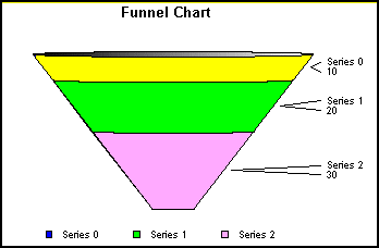
A funnel chart is basically a pie chart that shows only one group of data at a time from. The series in the group are stacked in the funnel with the first series at the top and the last series at the bottom.
Initial Setup: Use the following methods to define the initial setup of a funnel chart:
For every funnel chart, it is recommended that you remove the chart frame with setFrameDisplay (false). This overrides the default behavior (normally true for other chart types) and will create a better looking funnel chart. It removes the black rectangle around the funnel. Also note that you must set which group of data you wish to display.
Funnel chart specific Object IDs: The funnel chart contains three chart specfic objects - 1) the feelers, 2) funnel value labels, and 3) the funnel labels (frequently referred to as the series labels). The following methods return the object ID of these funnel chart objects:
Funnel Chart-Specific Properties/Methods:
The following property defines which group to display in the funnel chart. The default value is zero.
The following property defines the location of labels in a funnel chart.
nLocation can be set to a value in the range 0...2.
0=Labels on top of values drawn on the right of the funnel
1=Labels on the left of the funnel/Values on the right of the funnel
2=Values on the left or the funnel/Labels on the right of the funnel
The default value is zero.
The following pie chart properties can be used in funnel charts:
- setPieDepth (0...100); Sets the depth of the funnel chart. The default value is 30.
- setPieRotate (0...259); Sets the length of the Funnel tip. The default value is 50.
- setPieTilt (0...100); Sets the amount of tilt toward the viewer.
Other Recommended Methods: Set the chart frame to a transparent border color so that a black rectangle will not be drawn around the funnel.
To change the color of the funnel feeler (for example), use setBorderColor(). Example:
A Gantt chart provides a clear and simple expression of the initially scheduled start and completion dates of the events that contribute to a particular project. In Perspective for Java, series labels apply to tasks and group labels apply to the quality legend. Note that all date formats are Java based.
Initial Setup: Use the following methods for the initial setup of a Gantt chart:
Task Data: See "Data in Gantt Charts" in Chapter 6 for information about how to define the data set for a gantt chart.
Setting the Task Height: The height of all the tasks is set automatically to achieve the best layout using the current frame size. You can override the automatic layout by setting a fixed value in virtual coordinates using setTaskHeight().
DateScale: The datescale of the chart can be set by the following:
Where: newValue can be one of the following:
The default value is DATESCALE_DAYS.
Date Scale Rotation: The monthly and weekly datescale labels can be rotated using the following constants:
EXAMPLE:
Start/End/Current Dates: The starting, ending and current date of the Gantt chart must be set by the following methods:
The starting and ending dates set the range of visible dates on the chart. This is similar to setting the data range in other chart types.
The current date is defined as the tracking date. If a task is overdue, an extra dashed rectangle of additional time needed according to the percentage complete will be drawn in the chart. To turn off this feature, use setExtraTimeDisplay (boolean). Example:
To toggle the display of the percent complete scale at the right of the Gantt chart, use setPercentComplete (boolean). Example:
Quality Legend: The quality legend labels are set using the group labels. The following example sets three quality legend labels. Example:
The color of the quality label can be set using setFillColor. Example:
By default the quality legend is not displayed. To turn it on use:
The quality legend rectangle is set using setRect(). Example:
Most legend-specific properties and methods except legend scrolling that are used in other chart types can also be used in a gantt chart.
Alert Labels: These labels are visible when setToolTipDisplay is set to true. To set an alert label for a specific task, use the setAlertLabel() method. Example:
Data Text Format for Date Scales: The following date formats are supported for Gantt charts:
setDataTextFormat() is used to change the format of all date scales at the top of the Gantt chart. Example:
Date Utility Methods: The following date-related utility methods may also be used in a gantt chart:
Both of these methods return the date as a double (i.e, Java internal format).
Object Ids for Gantt Chart Items: Each object ID allows you to change certain attributes of the Gantt chart. Labels are generally allowed all font properties that can be set in other chart types. There may be some exceptions due to automatic spacing of tasks. Most object colors can be set by using the setFillColor() or setBorderColor() methods. See the Default Settings for Object IDs below to see examples of how colors, linewidth and virtual coordinates are set for various objects.
- getQualityLegendArea(); Quality legend area.
- getMonthScaleLabel(); Month scale label at the top of the chart.
- getDateScaleLabel(); Date labels either weekly or daily at the top of the chart.
- getWeekdaysScaleLabel(); Weekdays labels at the top of the chart.
- getTaskLabel(); Task label to the left of the frame.
- getRollupLabel(); Label that is rolled up for a task.
- getPercentCompleteTopLabel(); Percent complete top label to be underlined.
- getPercentCompleteLabel(); Percent complete bar label.
- getTask1(); First task ID for a task
- getTask2(); Second task ID for a task
- getPercentCompleteBar(); Percent complete bar
- getDateGrid() ; Date gridlines drawn vertically
- getCurrentDateLabel(); Current date drawn at the top above datescale labels
- getCurrentDateGrid(); Current date gridline
- getChildLinkLine(); Link line from one parent to a child task
Default Settings for Object IDs: The following code shows the default settings for the objects in a gantt chart.
When the GraphType property selects a guage chart (setGraphType (110)), the following properties can be used to modify the appearance of the chart:
- GaugeBackgroundStylef; Defines the style of the gauge background.
- GaugeDescending; Draw gauge values in ascending or descending order
- GaugeIgnoreBackgroundStyle; Ignore/obey the GaugeBackgroundStyle property.
- GaugeMajorAutoStep; Enable/disable automatic calculation of the number of major grid/tick steps. If this property is disabled (FALSE), Y1MajorGridStep defines the number of major grid steps.
- GaugeMajorTickRelativeTickLength; Get/set the relative length of major ticks.
- GaugeMinorAutoStep; Enable/disable automatic calculation of the number of minor grid/tick steps. If this property is disabled (FALSE), Y1MinorGridStep defines the number of major grid steps.
- GaugeMinorTickRelativeTickLength; Get/set the relative length of minor ticks.
- GaugeNeedleStyle; Get/set the gauge needle style.
- GaugeRelativeInnerRadius; Get/set the relative size of the inner radius.
- GaugeRelativeThickness; Get/set gauge's relative thickness.
- GaugeStartAngle; Get/set gauge start angle.
- GaugeStopAngle; Get/set gauge stop angle.
The following methods can be used to modify the appearance of the gauge:
- get/setGaugeAlphaChannel(); Get/set the amount (0.0...1.0) of highlighting applied to a guage object.
- get/setGaugeBandMax(); Get/set the maximum value of a gauge quality band.
- get/setGaugeBandMin(); Get/set the minimum value of a gauge quality band.
The setFontSize...() methods can be used to modify the size of gauge labels. Example:
The setTextFormatPreset() method can be used to change the format of gauge labels:
The setURL() method also works with Gauges. A URL can be attached to a gauge (multi gauge chart) as shown in the following example:
Also see the Gauge Chart objects.
In addition to dual-axes charts, Perspective also includes 3Y-, 4Y, and 5Y-axes charts (GraphType 103...105).
EXAMPLE:
Series must be assigned to the axes using setAxisAssignment().
By default, the series risers assigned to each axis are staggered. The AlignMultiYBars property can be used to align the bars on each axis.
By default, axis labels are staggered with odd numbered (1/3/5) axis labels on the left and even numbered (2/4) axis labels on the right. These default settings can be change with setAxisSide(). Example:
The size of each axis can be changed using the following method:
Where: newValue = 0...100. The default value is 1 (Automatic).
EXAMPLE:
If the axisSize is set to 0 (Automatic) for all axes, automatic sizing of axes and offsets will occur. This is the default setting for each axis. In other words, axes and offsets will be sized proportionally dividing the available space of the frame evenly. If an even distribution between each axis is desired, there is no need to set the axis size or the axis offset.
The axis offset from the base of the frame can also be set using the following method:
Where: newValue = 0...100. The default value is zero.
EXAMPLE:
With this feature, axes can be allowed to overlap. In most cases this may not be a desirable effect. If the axis sizes are set to non-zero values, appropriate relationships between the offsets and sizes must be set.
EXAMPLE:
The percentage of available frame space in this example are:
- 20% for the Y1 Axis
- 20% for the Y2 Axis
- 10% for the Y3 Axis
- 30% for the Y4 Axis
- 20% for the Y5 Axis
The following methods return the object ID of the Y3-, Y4-, and Y5-Axis titles:
The following example displays the Y3-Axis title:
When a pareto chart is selected (GraphType = 102), the X-axis scale is for group numbers. The Y-axis scale is the percent of the total accumulation for each selected series. Each chart displays a single series. Use the DisplayParetoSeries property to define the single series to be shown in the pareto chart. Example:
The default pareto series is zero. The ParetoDisplayThreshold property can be used to split the frame and accumulation line per the desired percent. (1...100). The default is -1 (no split). The following example will split the chart into two parts (30 % and 70 %).
To return to the normal display:
The following example creates a 40,60 split, colors 40% of the background blue, 60% green, the 40% line yellow, and the 60% line red.
The ParetoY2MajorGridStep property can be used to set the increment of the Y2Axis:
The ConnectParetoBars property can be used to connect/disconnect the bars in a pareto chart.
When a waterfall chart is selected (GraphType = 100 (vertical) or 101 (horizontal)), groups within the chart can be identified as Subtotals, Totals or Extra. The waterfall chart will automatically perform the cumulative sum when using Subtotal or Total. Groups labeled as Extra are ignored in waterfall calculations.
Data Setup & Restrictions: See "Data in Waterfall Charts" in Chapter 6.
Initial Setup: The following methods can be used to select a vertical or horizontal waterfall chart.
Waterfall Group Mode: The setWaterfallGroupMode() method assigns each group in the data set to be charted as a normal, a subtotal, total, or extra group.
Where:
nGroup is a group number
nGroupMode can be one of the following:
By default the group mode is set to NORMAL. If a waterfall group is set to SUBTOTAL or TOTAL, the data for this group is ignored and the cumulative total up to this point will be shown for this group. Only one group can be designated as TOTAL or EXTRA. TOTAL is computed the same way as a SUBTOTAL except there is only one of them. For best visual presentation, the group designated as EXTRA should be the last group in the chart. A group designated as EXTRA will not be used in performing any waterfall cumulative sums. It will appear just as stacked data. Group mode 4 (WATERFALLGROUPMODE_NORMAL_RESETTOZERO) is the same as mode 0 (WATERFALLGROUPMODE_NORMAL) except it resets the cumulative sum to zero before drawing.
See "Data in Waterfall Charts" in Chapter 6 for more information about setting up the data required for a waterfall chart.
You can change the bounding circle in polar and radar charts with the setTransparentBorderColor() and setBorderColor() Methods. The following code sets the bounding circle of a polar chart to red (new Color (255,0,0)):
You can change the start angle of all circular charts (polar, radar, pie) with the CircularChartStartAngle property. This property can be assigned a value in the range 0...359. Example:
You can show data markers only or data markers connected by lines in polar and radar charts with the ConnectLineMarkers property. Example:
These properties and methods control the color and shading of objects in a chart:
- Autoshading (true/false); This property enables (true) /disables (false) automatic shading of 3D cube walls and riser faces. When depth effect is applied to a 2D chart with DepthRadius, this property also applies shading to the faces of the 2.5D risers.
- ColorMode (0...2); This property sets the color mode to be used in the chart (automatic, color-by-series, or color-by-group). For 3D Surface charts, automatic mode will cause the chart to be colored by height. For Bar, Line, and Area charts, automatic mode will color the chart by series if there is more than one series or by groups if there is only one series The default value is zero (Automatic).
- ExactColorByHeight (true/false); This property enables (true) / disables (false) exact coloring by height in spectral maps and 3D surface charts. When this property is enabled (true), the actual data value is used to get a color from the "color-by-height gradient". When this property is disabled (false), the colors on the spectral legend are the only ones used and the data value is compared to determine which of those "buckets" it falls into.
- SeriesLooping (1...# of series in graph); This property is used to select the interval at which series color values are repeated. The default setting (32) defines different colors from the first 32 series (0...31). Starting with series 32, the colors are repeated (i.e., series 32...64 have the same colors and 0...31, respectively).
- get/setBorderColor(); These methods get/set the border color of an object.
- get/setFillColor(); These methods get/set the fill color of an object.
- get/setFillType(); These methods get/ets the fill type of an object in a chart. The fill type can be a color, gradient, or texture.
- getSelectionBorderColor(); This method returns the border color of the currently selected object.
- getSelectionFillColor(); This method returns the fill color of the currently selected object.
- get/setTransparentBorderColor(); These methods get and set the transparent border color of an object.
- get/setTransparentFillColor(); These methods get and set the transparent fill color of an object.
- setSeriesBorderColor(); This method can be used to set the border color of risers for a specified series in a chart.
- setSeriesFillColor(); This method can be used to set the fill color of risers for a specified series in a chart.
- getColorByHeight();When a chart is colored by height (rather than by series or by group), the charting engine chooses the color of quantative data representations based on the data values supplied to the chart. This happens in spectral map charts and in 3D surface charts. If, for example, the data ranges from 7 to 74 and the Y1 axis scale, therefore, goes from 0 to 80, the charting engine might have the color blue assigned to zero, red assigned to 80, and various interpolated shades for values between zero and 80. Note that Spectral Map charts do include a Y1 axis even though it is not visible in the chart. The getColorByHeight() method returns the IdentObj of the "color by height gradient" (in this case a blue to red one). With the object ID, your application can modify the gradient. Its end colors can be changed or the gradient could be made more complex.
When color-by-height is enabled with ColorMode (0) for Spectral Maps and 3D Surface charts and the user selects a data point (spectral marker or surface riser), the charting engine does not highlight the entire series. Instead, all data points that have the same color are highlighted. When the user selects a spectral legend marker, that marker will be highlighted plus the data points of the same value, if any. If the CNTL key is down, ONLY the current selection is highlighted.
When a spectral legend marker is selected, the user can change its color. This modifies the "color-by-height gradient" as follows: 1) if there is already a pin at that point on the gradient, the charting engine changes the color or 2) if not, the charting engine creates a new pin at that point and gives it the specified color.
When a data point is selected, the user can change its color as described above, except that if ExactColorByHeight is false, the charting engine changes the color of the appropriate spectral legend marker's value instead of the color for the exact data value. Example:
Using data ranges from 23 to 57, the gradient goes from Blue (20) to Red (60). There are spectral markers at 20, 25, 30, ...60. When the user clicks on marker "20" and changes it to Black, the colors are interpolated from Black (20) to Red (60). When the user clicks on data point "31" and changes its color to Green, a new pin with color Green is added at 0.25 ("31" is colored as if it were "30" and 30 is 25% of the way from 20 to 60). Now the colors are interpolated as follows: Black (20) to Green (30); Green (30) to Red (60). Example:
When the user clicks on data point "48" and changes its color to Yellow, a new pin is added at 0.7 (48 is 70% between 20 and 60) with the color Yellow. Now the colors are interpolated as follows: Black (20) to Green (30); Green (30) to Yellow (48); Yellow (48) to Red (60).
The following properties and methods can be used to control the display of shadows in a chart.
- get/setShadowColor(); These methods get and set the color of a shadow applied to an object.
- get/setShadowDisplay(); These methods get and set whether or not a drop shadow is displayed for a particular object in a chart.
- get/setShadowXOffset(); These methods get and set the offset in the X-direction of a drop shadow for a particular object in a chart.
- get/setShadowYOffset(); These methods get and set the offset in the Y-direction of a drop shadow for a particular object in a chart.
- ShadowXOffsetDefault (0...100); This property sets the default value for the X-Offset of a drop shadow. The default value is 30.
- ShadowYOffsetDefault (0...100); This property sets the default value for the Y-Offset of a drop shadow. The default value is 30.
These properties and methods can be used to apply textures and gradients to chart objects. To use a gradient or texture, the setFillType() method must select a gradient (i.e., setFillType (2);) or texture (i.e., setFillType (3);).
- get/setGradientDirection(); These methods get and set the gradient pin direction.
- get/setGradientNumPins(); These methods get and set the number of pins in a gradient.
- get/setGradientPinLeftColor(); These methods get and set the left color of the gradient pin.
- get/setGradientPinPosition(); These methods get and set the gradient pin position.
- get/setGradientPinRightColor(); These methods get and set the right color of the gradient pin.
- getTexture(); This method can be used to determine if a texture has been applied to a specific object in a chart or any object in a chart. When a texture name (i.e., a .GIF file name) is supplied is an input parameter, this method identifies whether or not the named texture is applied to any object in the chart. If an Object ID is specified (e.g., getTexture (getSeries (1));), this method will identify whether or not a texture is applied to the specific object.
- get/setTextureDisplayMode(); These methods get/set the texture display mode assigned to a specific object or all objects in a chart.
- setTextureURL();This method loads a texture from a file and applies it to object (s) in a chart. The fill type of the object (s) must be set to texture using the setFillType() method (e.g., setFillType (getSeries (1), 3);).
The following example code shows how the setFillType() and texture methods can be used to assign a texture to series one in a chart.
Alternate formatting objects and methods can be used to apply different colors to sections of an axis and axis labels. You may also define a text label to show with an alternate formatted section. The following objects support alternate formatting of an axis and axis labels.
Use setDisplay() and omit the nIndex parameter to enable alternate formatting of the axis and/or axis labels. Example:
When alternate formatting is enabled for an axis, use the alternate formatting methods to define how many sections/colors will be defined and the location on the axis to separate the sections.
- get/setAltFmtFrameNumColors(); Get/set the number of different colors/sections where alternate formatting can be applied to a specified axis.
- get/setAltFmtFrameSeparator(); Get/set the position of alternate formatted sections on a specified axis.
After an alternate formatting object has been enabled with setDisplay() and alternate formatting methods define the number of colors/sections and frame separator location, use the setDisplay() method again to enable each section and setFillColor() to apply colors to each section. Example:
Use the setTextString() method to define section labels. Example:
These two code segments produce a chart in the following format:
Beveled borders can be applied to annotations, title, subtitle, footnote, 2D risers, legend box and legend markers.
Object IDs: Beveled borders can be applied to the following objects:
Enable/Disable Beveled Borders: The setDisplay() method enables/disables beveled borders for a specified object:
Example:
For the getBeveledLegend(), getBeveledLegendMarker(), and getBeveledRiser() objects, the setDisplay() method is all that is needed to show default beveled borders. For annotation, footnote, subtitle, and title box objects, the setDisplay() method enables the bounding box around the object. The border type and insets must also be set for these objects.
get/setBorderType(): These methods get/set the border type for a specified object. The default value is BORDER_NONE for beveled legend objects and BORDER_LINE for annotation, footnote, subtitle, and title box objects.
nBorderType; Can be one of the following border types:
get/set...Insets(): These methods get/set the top/bottom and right/left insets of borders of a specified object. The default value is 1 (which is essentially off).
Example:
get/setCornerArcWidth/Height(): These methods get/set the width and height of the corner arc of a border applied to an object. The default value is 5.
Example:
Annotation Example: The follow example code creates an annotation and applies a beveled border to the annotation box.
The following properties and methods can be used to pan, rotate, and scale the cube in a 3D chart:
- CubeZoomFactor (0...100); This property sets the global scaling factor for zooming in/out.
- CubePanX (0...100); This property pans the 3D chart cube (in 2D virtual coordinates) in the X direction within the chart frame. The default value is 0.
- CubePanY (0...100); This property pans the 3D chart cube (in 2D virtual coordinates) in the Y direction within the chart frame. The default value is 0.
- get/setCubeRotationMatrix(); These methods get and set the rotation matrix of the cube in a 3D chart.
These properties are used to enable/disable and select the level at which chart objects can be edited in the user interface:
- HiliteBarResize (True/False); When this property is enabled (true), Perspective will show the riser's value when the user clicks and drags the riser in a bar chart.
- ReshapeEnable (True/False); This property enables (true) / disables (false) the user's ability to move and resize objects in a chart. The default value is True.
- ResizeBarMode (True/False); This property enables (true) / disables (false) the user's ability to resize bars in a chart. The default value is False. When this property is enabled, the user can use the control key and mouse to resize the bars in a chart. This action will also adjust the value associated with the riser.
- SelectionEnable (0...5); This property defines the user's ability to select objects in a chart and the operations that can be performed when one or more objects are selected. When SelectionEnable (1) is used, the user can select individual objects (risers, markers, labels, etc.) in a chart. The charting engine highlights each object that is selected. When SelectionEnable (2) is used, the user can only select data-related objects (bars, legends, etc.). The charting engine will highlight the selected data objects and all related objects. When SelectionEnable (3) is used, the user cannot select individual objects. When one object is selected, all related objects will also be selected and highlighted. When SelectionEnable (4) is used, the user can click on a single point and have the chart zoom at the rate of 50% on both axes with the selected point used as the center of the zoom rectangle. When SelectionEnable (5) is used, it allows the user to drag out a rectangle and drill-down on the data within the rectangle area. When this mode is used, a single mouse click will back up one data-zoom level or drill-down. Double click will restore the original un-zoomed data state. See "Data Zooming" in Chapter 6 for more information about using SelectionEnable (4) and SelectionEnable (5).
- SelectionEnableMove (True/False); This property enables (true) / disables (false) the user's ability to select and move individual objects (risers, markers, labels, etc.) in a chart. The default value is True.
Also see "Colors and Shading" for more information about how objects are highlighted when they are selected in the user interface.
Perspective provides informational messages strings that can be enabled for display in the user interface when the user positions the mouse pointer over a selectable object in a chart. The following properties and methods control the format, contents, mode, and frequency of these messages in the user interface.
- ToolTipDelay (integer); This property gets/sets the delay (in milliseconds) at which tool tips (CharTips and WidgeTips) will be displayed. The default value is 500.
- ToolTipDisplay (True/False); This property enables/disables the display of tool tips. The default value is false
- ToolTipMode (True/False); This property toggles CharTips between explicit developer information and user level information.
- setDeveloperToolTip (String CustomToolTip); When ToolTipDisplay is enabled (true) and ToolTipMode selects developer mode (true), this method can be used to define a custom tool tip string that will be displayed when the user positions the mouse cursor over an object in a chart. Also see the example program (ToolTipDemoOne) in Appendix C.
- setDeveloperToolTipDefault(); This method selects the default developer tool tips provided with the application.
- setDynamicToolTip (String, a ToolTip); This method can be used to set the dynamic tool tip to any specific string. If NULL or "" is used, a tool tip will not be generated. Multiple lines may be used in the string definition. See the macros defined below.
- setToolTipBackdropColor(); This method can be used to change the color of a backdrop/shadow behind tooltips.
- setToolTipBackdropSize(); This method can be used to change the size of the backdrop/shadow behind tooltips.
- setToolTipBackgroundColor(); This method can be used to change the background color of tooltips.
- setToolTipColor(); This method can be used to change the color of tooltip text.
- setToolTipFontName(); This method can be used to change the font to be used for tooltip text.
- setToolTipFontSize(); This method can be used to change the font size to be used for tooltip text.
- setToolTipFontStyle(); This method can be used to change the font style (bold, italic, underlines, etc.) to be used for tooltip text.
- setToolTipOff(); This method turns off the generation of events for tool tips.
- setToolTipOn(); This method turns on the generation of events for tooltips.
- setUserToolTip (String CustomToolTip); When ToolTipDisplay is enabled (true) and ToolTipMode selects user mode (false), this method can be used to define a custom tool tip string that will be displayed when the user positions the mouse cursor over an object in a chart.
- setUserToolTipDefault(); This method selects the default user-mode tool tips provided with the system.
The custom strings defined by setDeveloperToolTip() and setUserToolTip() can include the following macros that are expanded to chart object information:
EXAMPLE:
Also see the ToolTipDemo sample program in Appendix C for an example of how the tool tip properties and methods are used.
NOTE: You can also use the ToolTipCallback Interface to generate tooltips in your user interface. See ToolTipCallback Methods.
Multiple instances of two objects are all that is required to create annotations. They are the label and box drawn behind it (if any). Both the label and box have attributes associated with them. These attributes can be set using methods in Perspective for Java that are available for other chart objects (e.g., setTextString(), setFillColor(), etc.).
Object IDs: The following object IDs are used to create annotations:
where: index is a value in the range zero (0) to the maximum number of annotations set by setMaxNumAnnotations(int nMax). The default maximum number of annotations is 30.
Note that the title, subtitle and footnote objects have the same behavior as annotations. Their Object IDs are returned by the following methods:
Enable Annotation: The setDisplay() method must be used to enable the annotation object:
Annotation Label/String: The setTextString() method can be used to define an annotation's label/string:
Annotation Text Color: The setFillColor() method can be used to define the color of the annotation label/string:
Note that all other fill types are also available for annotation labels (i.e., gradient, texture, etc.).
Set Annotation Font Size: The normal font size methods can be used to set the font size of an annotation label. Example:
Annotation Location: The setRect() function can be used to specify the location of an annotation object. Example:
NOTE: If you do not specify a location, the annotation text will draw in the default location (center of the chart) and will not be detectable! This is due to the fact that a rectangle is not internally stored for the annotation. Unless specified otherwise, it will use the the default rectangle set by setRect(). It is recommended you store a rectangle location for each annotation.
Example:
Enable Annotation Box: The setDisplay() method must be used to enable the annotation box object:
Annotation Box Color: The setFillColor() method can be used to define the color of the annotation box:
Enable/Disable Annotation Box Border Color: The setTransparentBorderColor() method can be used to enable/disable the border color around the annotation box:
See "Beveled Borders" for information about applying a border to an annotation box.
Example:
Initial/Default Annotation Box Settings: The default maximum number of annotations is 30. For this first default set of annotations, the transparent fill color is set to true and border colors are omitted for the associated annotation box:
Maximum Number of Annotations: The following methods can be used to get/set the maximum number of annotations:
Where: newValue can be a value in the range 0...999.
For annotations in excess of the default (30), the setTransparentFillColor() and setTransparentBorderColor() methods should be used to set transparent fill and border colors for the associated annotation box as desired:
When the UseSampleData property is disabled (setUseSampleData (false);), you can use one of the following methods to import and use your own custom data in a chart:
- Load Data from a server-based text file
- Place data directly within your HTML page
- Load data using an SQL query to any JDBC/OCBC compliant database
- Pass a data object from another Java class or applet
- Register a data object within your own class to "feed" data automatically to Perspective for Java
- Set individual values for the chart within your Java code
See Chapter 6 for specific information about loading data into a chart and Perspective properties and methods that support the data interface.
When the user selects objects in a live chart, the items that are selected may be added to a selection list. Perspective methods let you examine and modify this list and apply attributes to items in the list. The following methods can be used to examine and modify items in the selection list:
- getSelection(); This method can be used to get the selection list.
- getSelectionBorderColor(); If the first item in the selection list has a border, this method can be used to determine the item's border color (if any).
- getSelectionFillColor(); If the first item in the selection list is an area object, this method can be used to determine the object's fill color (if any).
- getSelectionID(); This method returns the object ID of the currently selected object.
- getSelectionLineWidth(); If the first item in the selection list is a line object, this method can be used to determine the width of the line.
- getSelectionSize(); This method can be used to determine the size of the currently selected object.
- getSelGroup(); This method returns the group number of the currently selected group.
- getSelSeries(); This method returns the series number of the currently selected series.
- isSelection(); This method can be used to determine whether or not there are any items in the selection list.
- isSelectionBorderColorTransparent(); If isSelection() returns true, this method can be used to determine whether or not the first item in the selection list is transparent border color.
- isSelectionCube(); If isSelection() returns true, this method can be used to determine whether or not the first item in the selection list is a 3D cube.
- isSelectionDataLabel(); If isSelection() returns true, this method can be used to determine whether or not the first item in the selection list is a data label.
- isSelectionFillColorTransparent(); If isSelection() returns true, this method can be used to determine whether or not the first item in the selection list is a transparent fill color.
- isSelectionGridLine(); If isSelection() returns true, this method can be used to determine whether or not the first item in the selection list is a grid line.
- isSelectionLegend(); If isSelection() returns true, this method can be used to determine whether or not the first item in the selection list is the legend area.
- isSelectionLine(); If isSelection() returns true, this method can be used to determine whether or not the first item in the selection list is a line object.
- isSelectionRiser(); If isSelection() returns true, this method can be used to determine whether or not the first item in the selection list is a riser object.
- isSelectionSeriesRelated(); If isSelection() returns true, this method can be used to determine whether or not the first item in the selection list is series related.
- isSelectionText(); If isSelection() returns true, this method can be used to determine whether or not the first item in the selection list is a text object.
- setSelection(); This method can be used to add an item to the selection list.
The following properties can be used to manipulate how objects are selected in a chart and, therefore, how they are added to the selection list:
- SelectionEnable; This property enables/disables the user's ability to select objects in a chart and to enable/disable data zooming in the user interface. This property has five selectable options: 1) user can select individual objects (risers, markers, labels, etc.) in a chart, 2) user can only select data-related objects (bars, legends, etc.), 3) user cannot select individual objects, 4) user can click on a single point and have the chart zoom at the rate of 50% on both axes with the selected point used as the center of the zoom rectangle, 5) allows the user to drag out a rectangle and drill-down on the data within the rectangle area.
- SelectionEnableMove; This property can be used to enable/disable the user's ability to select and move objects in a chart.
Use these methods to load and save files:
Note that the load methods expect the input stream or URL file to be an ASCII text file that contains Perspective method and property directives. The save() method saves the Perspective method and property directives necessary to recreate the chart in an ASCII text file that can be viewed or edited with a normal text editor.
The following methods can be used to load and save charts from/to an FTP server:
The following method can be used to save a chart in Graphics Interchange Format (.GIF):
The following method can be used to save a chart in JPEG File Interchange Format (.JPG):
The following method can be used to save a chart in Portable Network Graphs (.PNG) format:
The following method can be used to save a chart in Scalable Vector Graphics (.SVG) format:
The following properties can be used to enable/disable and control SVG output:
- OutputSVG; Enable/disable drawing in SVG format
- DocumentHeightInTwips; Output height in TWIPs (1/20th point or 1/100th millimeter)
- DocumentWidthInTwips; Output width in TWIPs (1/20th point or 1/100th millimeter)
The URL methods allow you to include drill-downs in HTML files. When the user selects/clicks on an object in a chart where a setURL() is defined, the HTML file provided as an input parameter to the method will automatically be loaded and displayed at the location specified by the setURLTarget(). For example, in the example HTML file below, setURL() selects a different .HTML file for each series/group (slice) in a pie chart. The example setURLTarget() defines the location in the page where each HTML file will be displayed:
<html><head><title>Pie Drill Down Example</title></head>
<body>
<p><applet code="TDGChartApplet.class" archive="javaCHARTg.jar" width="400" height="280">
<param name="TDGSCRIPT" value="setTitleString ("Pie Chart with Drilldown");
setSubtitleString ("Click on the slices to see a description");
setGraphType (55);
setSeriesLabelArray (
     "Monday",
     "Tuesday",
     "Wednesday",
     "Thursday",
     "Friday");
     setDataSeries (35.00);
     setDataSeries (27.00);
     setDataSeries (15.00);
     setDataSeries (17.00);
     setDataSeries (27.00);
     setURL (0, 0, "series0.html");
     setURL (1, 0, "series1.html");
     setURL (2, 0, "series2.html");
     setURL (3, 0, "series3.html");
     setURL (4, 0, "series4.html");
     setURLTarget (0, 0, "Bottom");
     setURLTarget (1, 0, "Bottom");
     setURLTarget (2, 0, "Bottom");
     setURLTarget (3, 0, "Bottom");
     setURLTarget (4, 0, "Bottom");
     setToolTipDisplay (1);"></applet></p>
<br>
<br>
<p><a href="series2.html" target="Bottom">Show the Series2 page by force</a></p>
</body></html>
Perspective includes a standard JAVA-style event listener interface and event handler method for collecting events that are specific to the chart user interface. The TDGEvent class defines a set of events that the TDGListener interface can respond to from the chart user interface. See the TDGEvent class and the TDGListener interface below under "Classes & Interfaces" for details.
An object ID identifies a sub-element in a chart that you can color, display, and, in general, individually apply properties to. Many of the methods described in this chapter require an object ID as an input parameter. The object ID can be provided as an IdentObj data type from the PerspectiveBase class. Example:
See Chapter 9 for an indexed list of methods that return an IdentObj. The following example code shows how to use these methods to identify an object.
/* A basic extension of the java.applet.Applet class*/
import java.awt.*;
import java.applet.*;
import tdg.Perspective;
public class Applet1 extends Applet
{
     public void init()
     {
          setLayout (null);
          setSize (426,266);
          perspective1 = new tdg.Perspective();
          perspective1.setGraphType (0);
          perspective1.setDisplay (perspective1.getCubeFloor(), false);
          perspective1.setBounds (36,12,372,192);
          add (perspective1);
     }
     //{
          DECLARE_CONTROLS tdg.Perspective perspective1;
     //}
}
Perspective for Java is provided in the following classes and defined interfaces:
The NumberFormatCallBack class represents an abstract interface to an object that formats the numbers in a Perspective for Java chart.
CONSTRUCTOR:
The Perspective class is the public interface to Perspective for Java. It inherits all of the methods in the PerspectiveBase class.
CONSTRUCTOR:
INPUT:
EXAMPLE:
/* A basic extension of the java.applet.Applet class */
import java.awt.*;
import java.applet.*;
import tdg.Perspective;
public class Applet1 extends Applet
{
     public void init()
     {
          setLayout (null);
          setSize (300,200);
          perspective1 = new tdg.Perspective();
          perspective1.setBounds (0,0,300,200);
          add (perspective1);
     }
     TDG.Perspective perspective1;
}
The Perspective class inherits all of the methods in PerspectiveBase as well as those in Perspective.
CONSTRUCTOR:
Since the Perspective class inherits all of the methods in PerspectiveBase, the PerspectiveBase constructor is not normally required or used.
This interface defines a group of methods that can be used to get and set data in a chart when the setDataFromCallBack() method is used to slave chart data to an arbitrary Java Object.
TDGDataGrid is an abstract interface. It defines a series of methods that you must implement into an object. The TDGDataGrid interface represents an abstract data model that is one way of preparing data for graphing.
This interface defines a method for getting the chart title in a Pie-Bar chart.
This extension of the event class provides methods for listeners to obtain error events.
TDGEvent is the root event class for all Perspective-level events. It is used in conjunction with the TDGListener Interface to collect user-interface related events.
CONSTRUCTOR:
INPUT:
source - the Perspective where the event originated
id - the event type
This method constructs a TDGEvent object with the specified source Perspective and type.
Perspective includes a standard JAVA-style event listener interface and event handler method for collecting events that are specific to the chart user interface. TDGListener is the listener interface for receiving perspective events. The TDGEvent class defines a set of events that the TDGListener interface can respond to from the chart user interface. The following methods support the listener interface:
- addPerspectiveListener (TDGListener listener); Defined in PerspectiveBase class
- perspectiveEvent (TDGEvent e); Defined in the TDGListener interface.
The addPerspectiveListener() method defines the listener interface.
EXAMPLE:
This method creates an instance of an abstract class or interface to catch high-level events defined by the Perspective for Java integration. The "this" pointer refers to the object in which this method is invoked. This method also tells the charting engine to notify the perspectiveEvent() method when a Perspective event occurs.
The perspectiveEvent() method will be called with an event object when an Perspective event occurs. The perspectiveEvent() must be included and defined in the "this" object identified by addPerspectiveListener(). The definition of the perspectiveEvent() method should indicate handling of events that are reported by the charting engine.
EXAMPLE:
public void perspectiveEvent (tdg.event.TDGEvent event)
{
    Object object = event.getSource();
    if (object == perspective1)
    perspective1_perspectiveEvent (event);
}
The events are defined in the TDGEvent class. Also see the "FullMetalListener" sample program in Appendix C for an example of how to use addPerspectiveListener() and perspectiveEvents() and how to enable, collect, and process Perspective events.
This interface defines methods for getting information about nested ordinal axis labels.
This interface is used in conjunction with the TDGDataGrid interface to handle large data sets.
This interface defines a dynamic callback function to produce a tooltip.